Goodfly.
Goodfly, Good vibes.
Travel by your principles.
Art direction
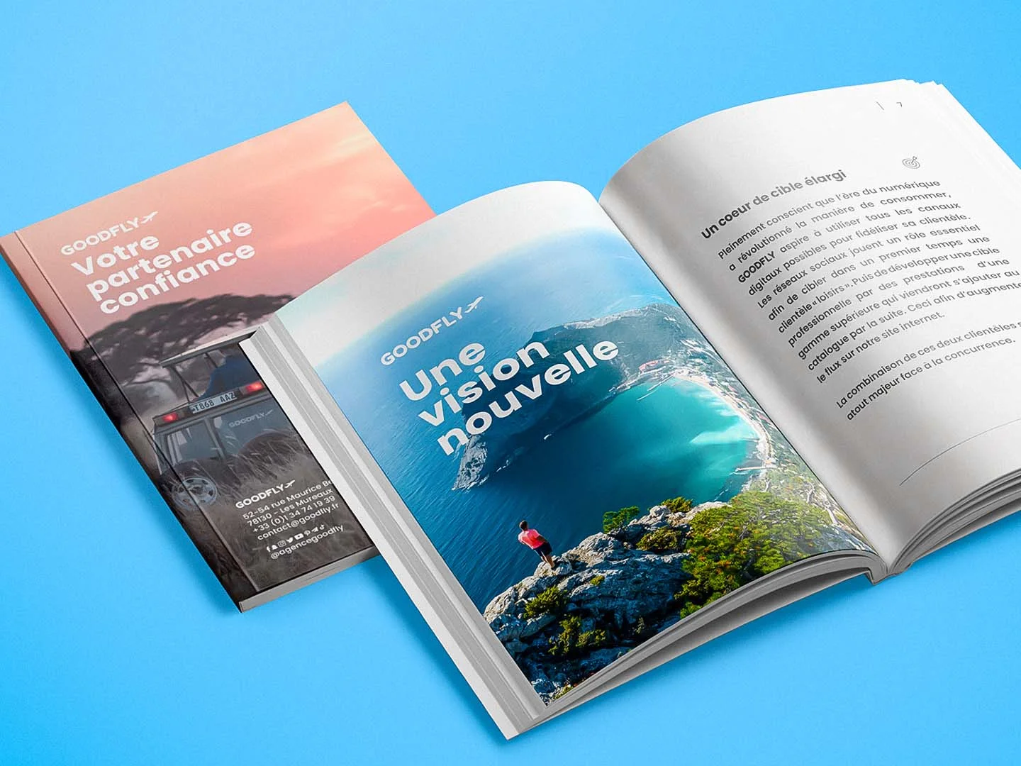
Campaigns & print
Building a brand
in the noise.
Launching a neighbourhood travel agency in a market saturated with impersonal giants. Building a distinctive visual world from the very start — one able to hold its own on a Parisian storefront, an urban billboard and a smartphone screen alike. A complete branding effort, from the birth of the name to its final rollout.
We began where most agencies finish: with the name. Before the logo, before the colour, before the first mockup — we had to find the word that holds the entire promise.
Goodfly — short, sonorous, legible in every language. Evocative without being literal. A word that brings together the promise (good) and the action (fly). It is the invisible foundation on which everything else was built.
“A short name. A long promise.”
From that foundation, every piece of the system was designed to live at large scale and small alike: a logo that instantly evokes travel, a colour that evokes the blue of sky and sea, a typeface that is modern, confident and accessible. A visual grammar that speaks to today's traveller.
A plane,
but different.
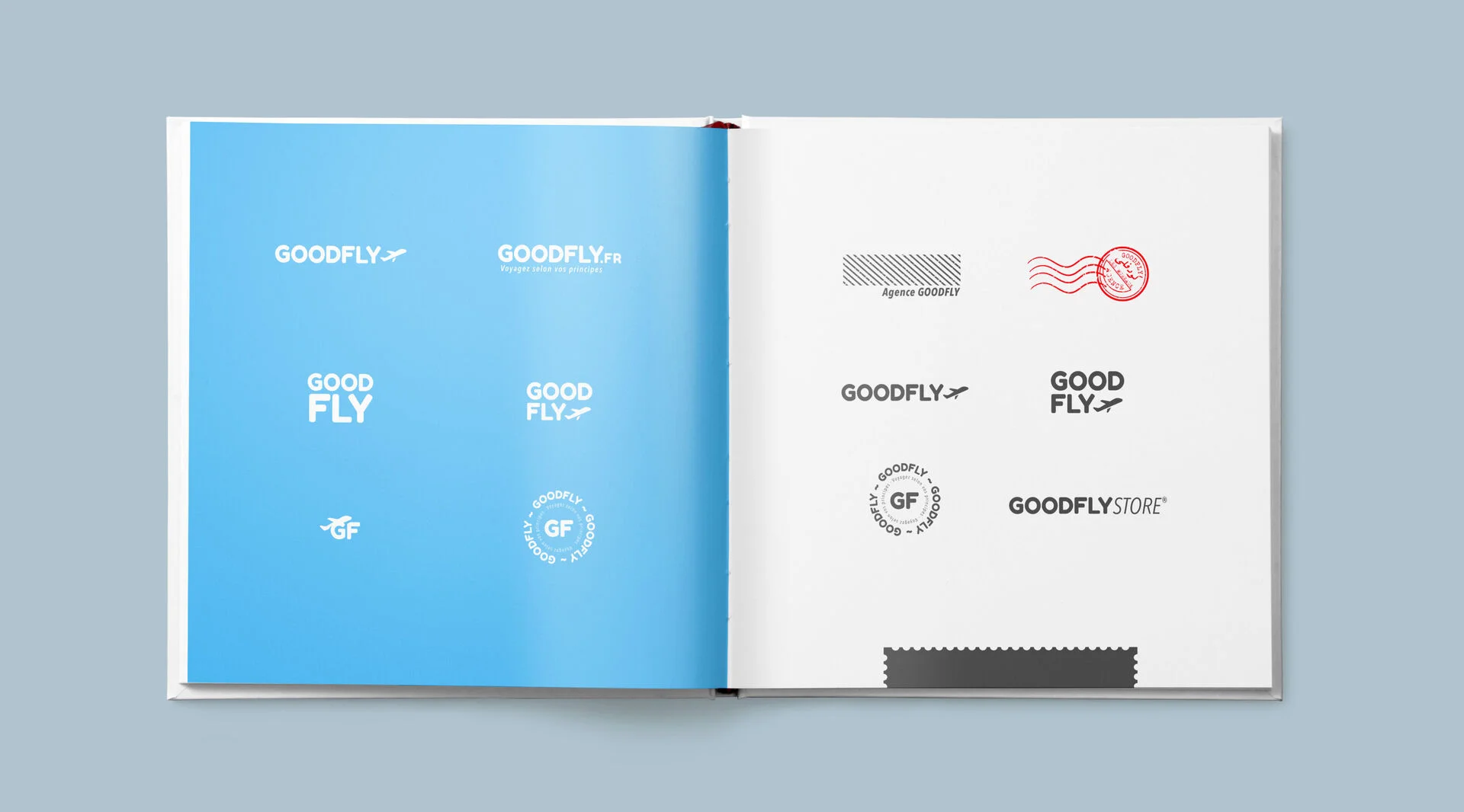
There is no avoiding the plane in a brand that speaks of travel. Rather than running from it, we reinterpreted it: a pictogram drawn like a signature, woven into the wordmark, fading back or stepping forward depending on the medium.
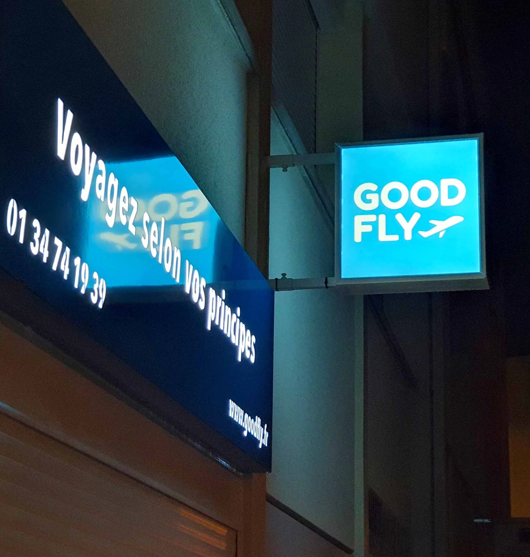
The system comes in two versions: a standalone wordmark for editorial and institutional contexts, and a version with the plane pictogram for signage, short formats and any use where the identity must be legible in a fraction of a second.
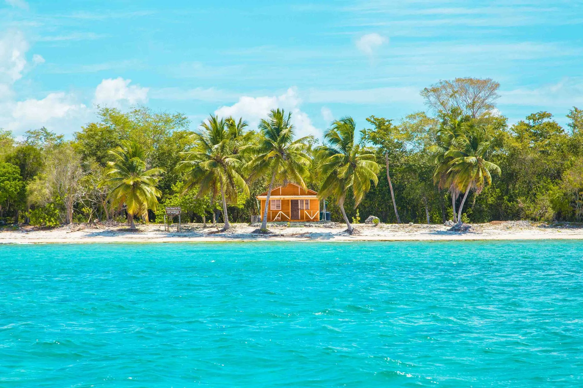
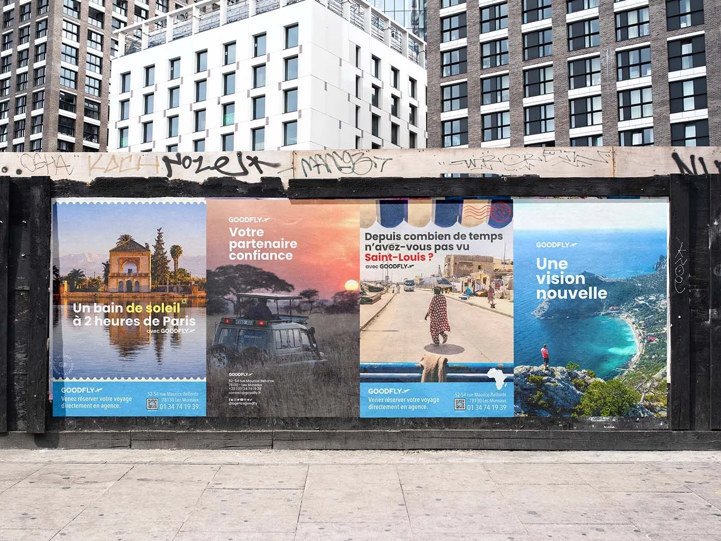
The palette plays on accents tailored to the destination on show: every campaign stays recognisable as Goodfly while evoking the place — the heat of a desert, the freshness of a coastline, the depth of an urban night.
- Logo Standalone wordmark
- Typography Modern sans-serif
- Palette Contextual accents
- Pattern Graphic signature
The brand
on the street.
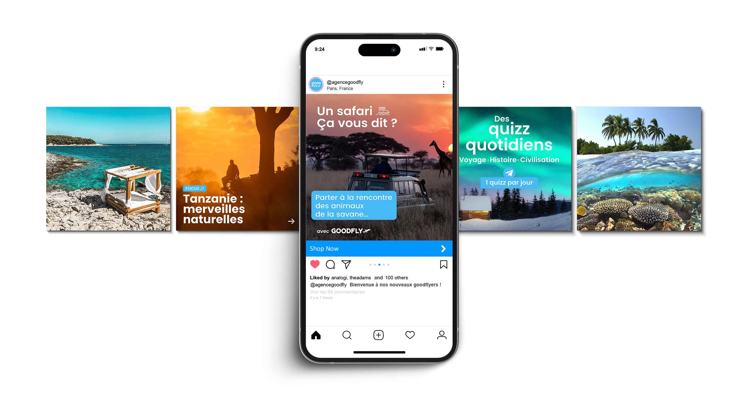
Once the identity was set, we rolled the brand out across seasonal campaigns — outdoor advertising in Paris, digital variations on social media, customer brochures. Every campaign follows the same brief: evocative photography, bold typography, a contextual colour accent.
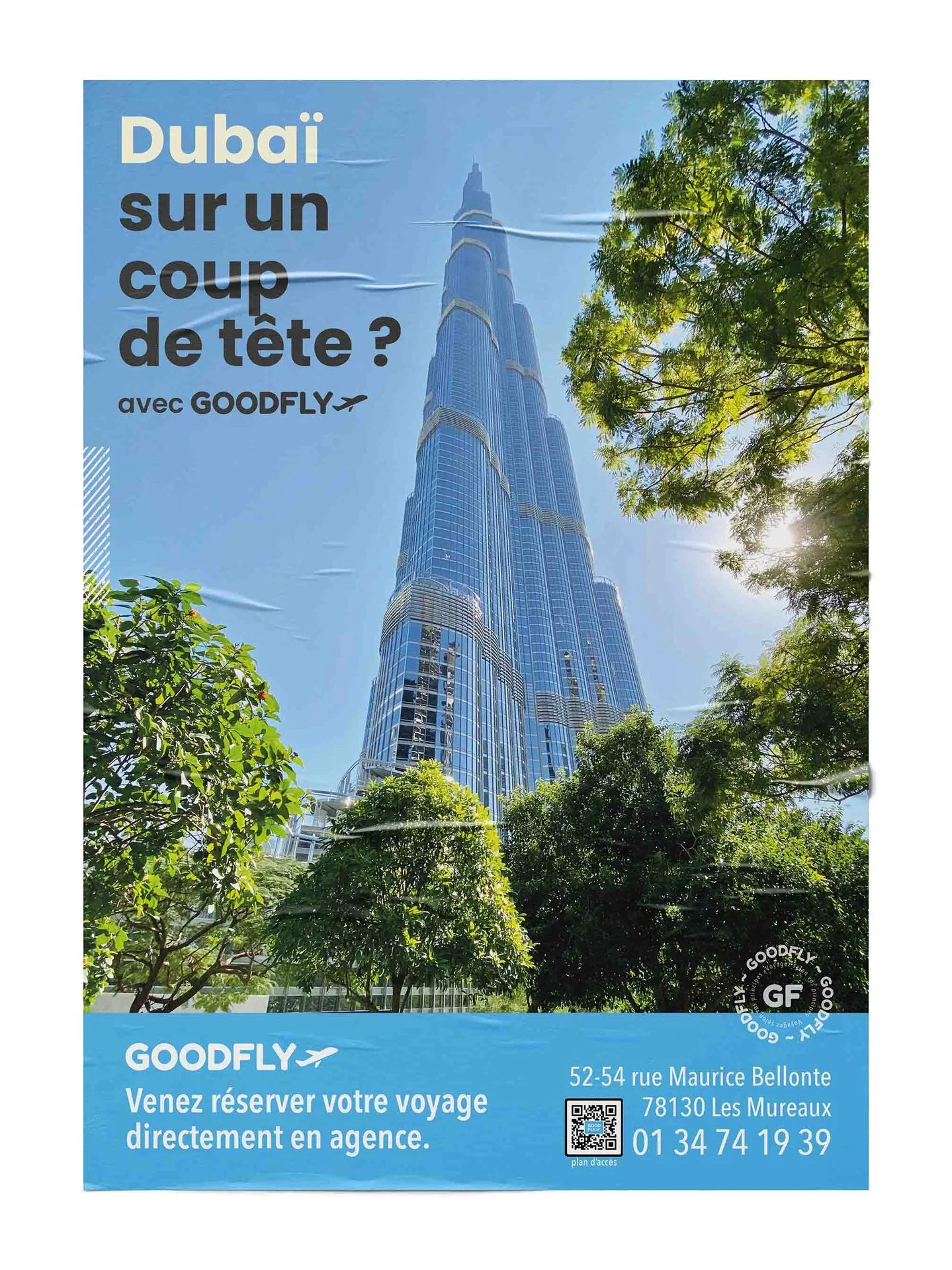
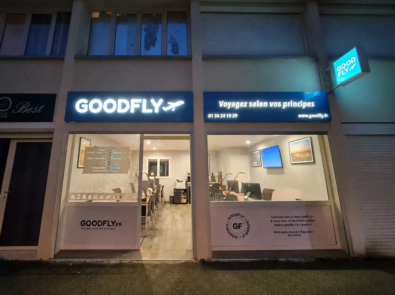
A storefront,
a manifesto.
The brand lives on the street. The Parisian storefront was conceived as a graphic object in its own right — signage, furniture, stationery. Everything that makes up the in-store customer experience was designed with the same consistency as the posters.
Four years on,
the identity holds firm.
No major rebrand. Just seasonal evolutions that enrich the system without contradicting it. That is exactly what we look for when building a brand: not a dated project, but a living framework — one able to welcome the passing of time, changing destinations and travellers.