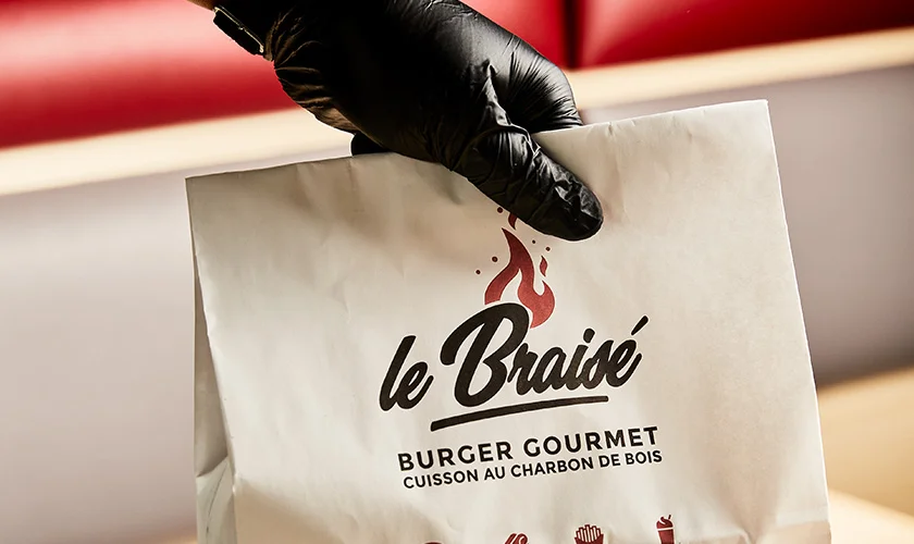
Le Braisé.
The taste of the flame, as a signature.
The taste of the flame, as a signature.
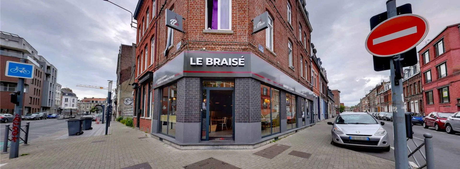
Le Braisé is the gourmet burger flame-grilled over charcoal, right in the heart of Lille. For a kitchen built entirely on fire and generosity, the identity had to radiate warmth and craft.
Our brief: create the logo and set the full art direction — from the symbol to the illuminated sign, from the seal branded into the bun to the photography direction — making the flame the signature of the brand.
At the heart of the identity: a hand-drawn flame, set on warm, spontaneous lettering. "Le Braisé" reads like a signature — alive, indulgent, never static.
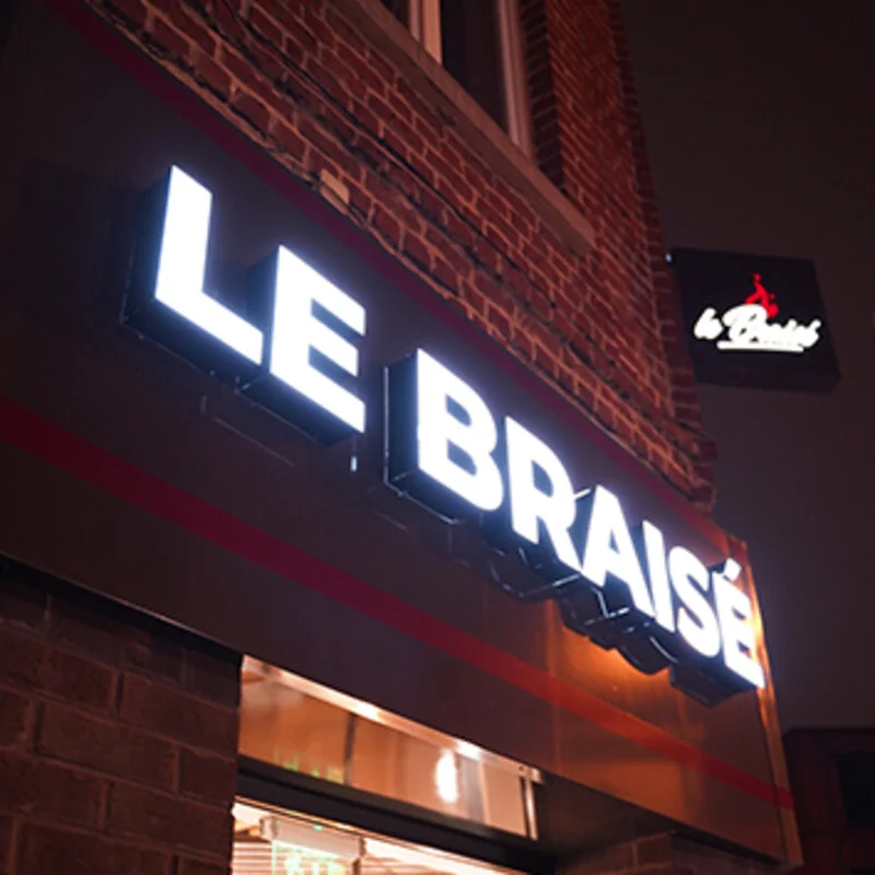
An ember gradient, from blazing orange to deep red, that works just as well in black or in reverse, living on everything from the illuminated sign to the smallest format.
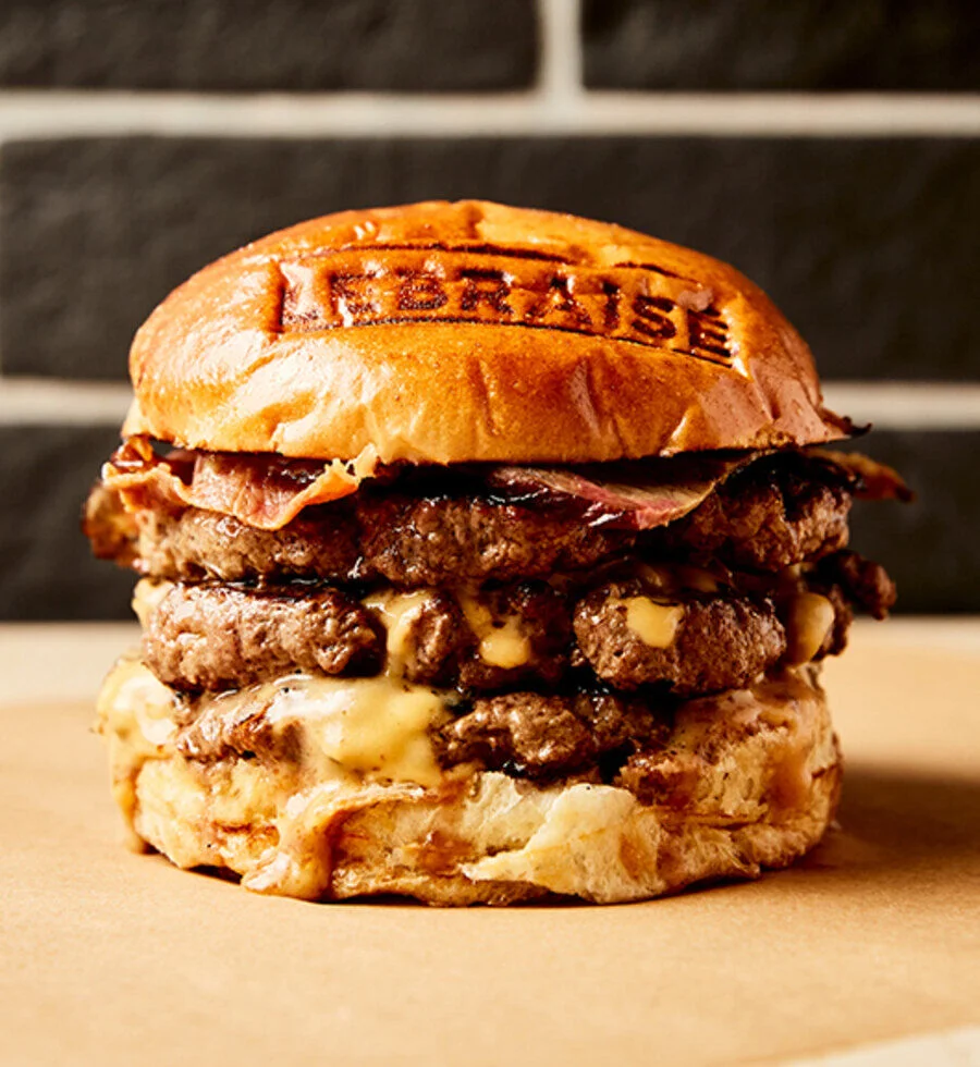
The brand doesn't stay on paper: it lights up the storefront and is seared into the bun. The logo becomes a true seal, branded onto every burger — art direction taken all the way to the plate.
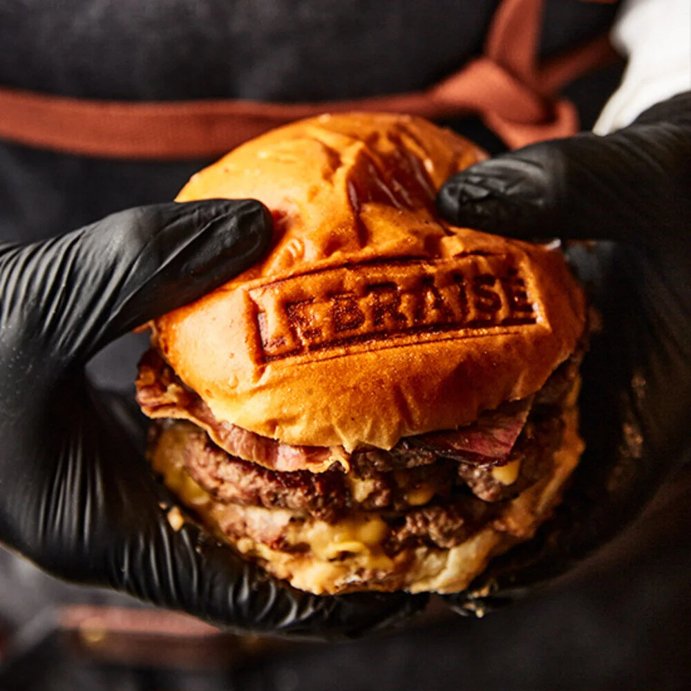
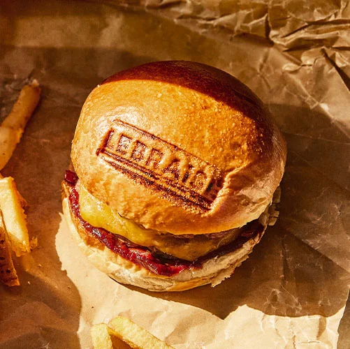
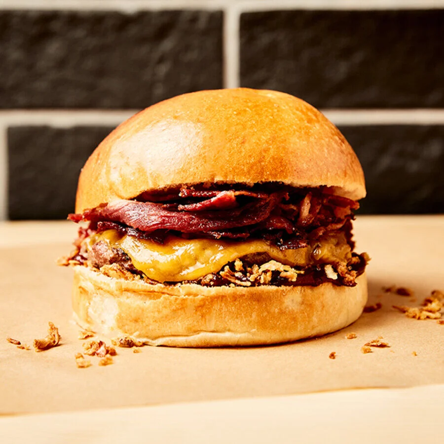
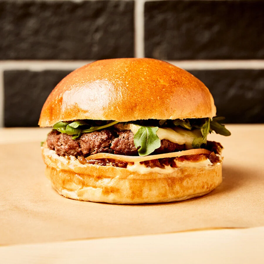
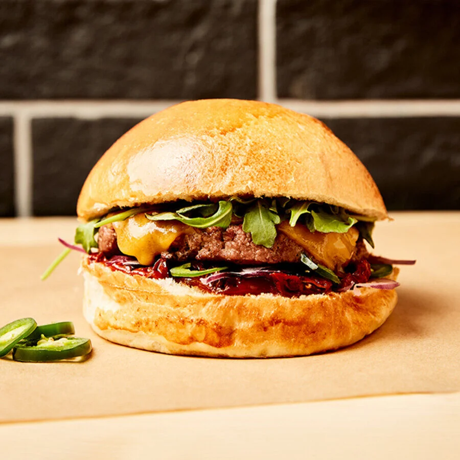
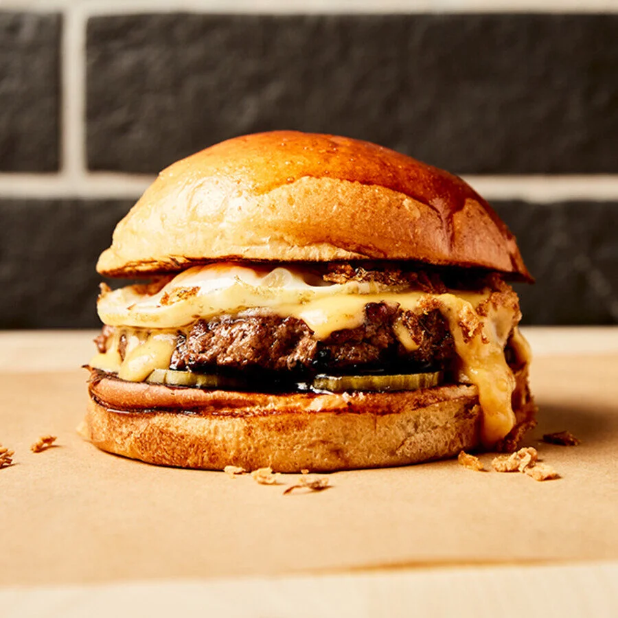
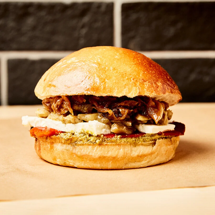
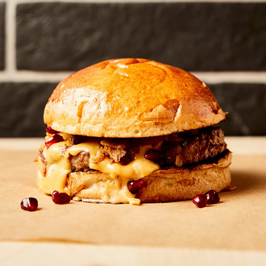
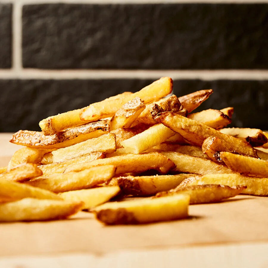
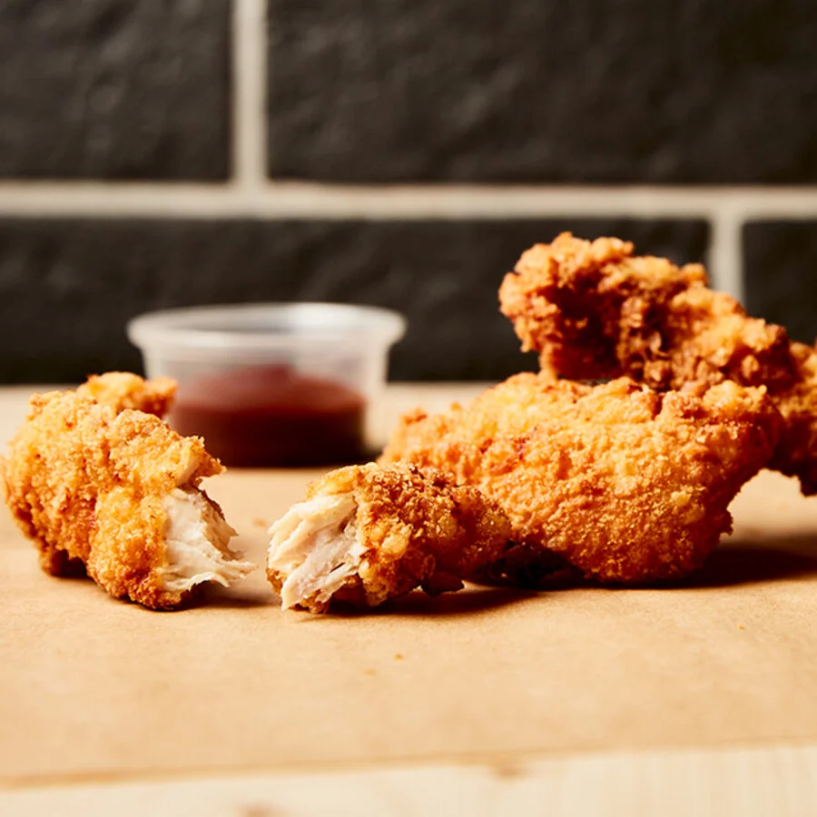
A rich, warm photography direction: black brick backdrop, golden light, kraft paper. Every recipe is shot like a portrait — from the signature Le Braisé to the fresh house-cut fries.
"Cooking that is authentic and timeless."