Royal Bun's.
The smash, the royal way.
The smash, the royal way.
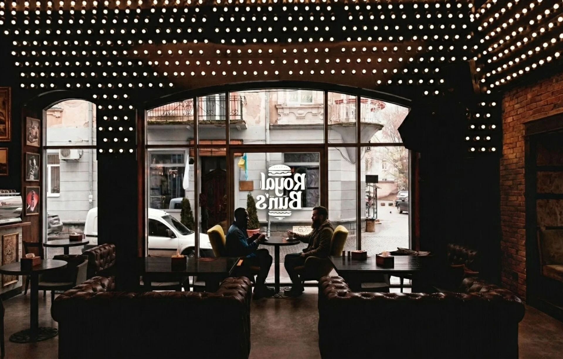
Royal Bun's is all about smash burgers and tacos, made from scratch. In a fiercely competitive market, the brand needed to be indulgent, generous and instantly recognisable — whetting your appetite the moment you spot the storefront.
Our brief: build the entire identity — from the logo to the packaging, from food photography to communication — and give the brand a signature as mouth-watering as its recipes.
At the heart of the logo: the burger, drawn with relish and set on bold, rounded lettering. An appetising red lifted by orange and a touch of green — the colours of hunger and freshness.
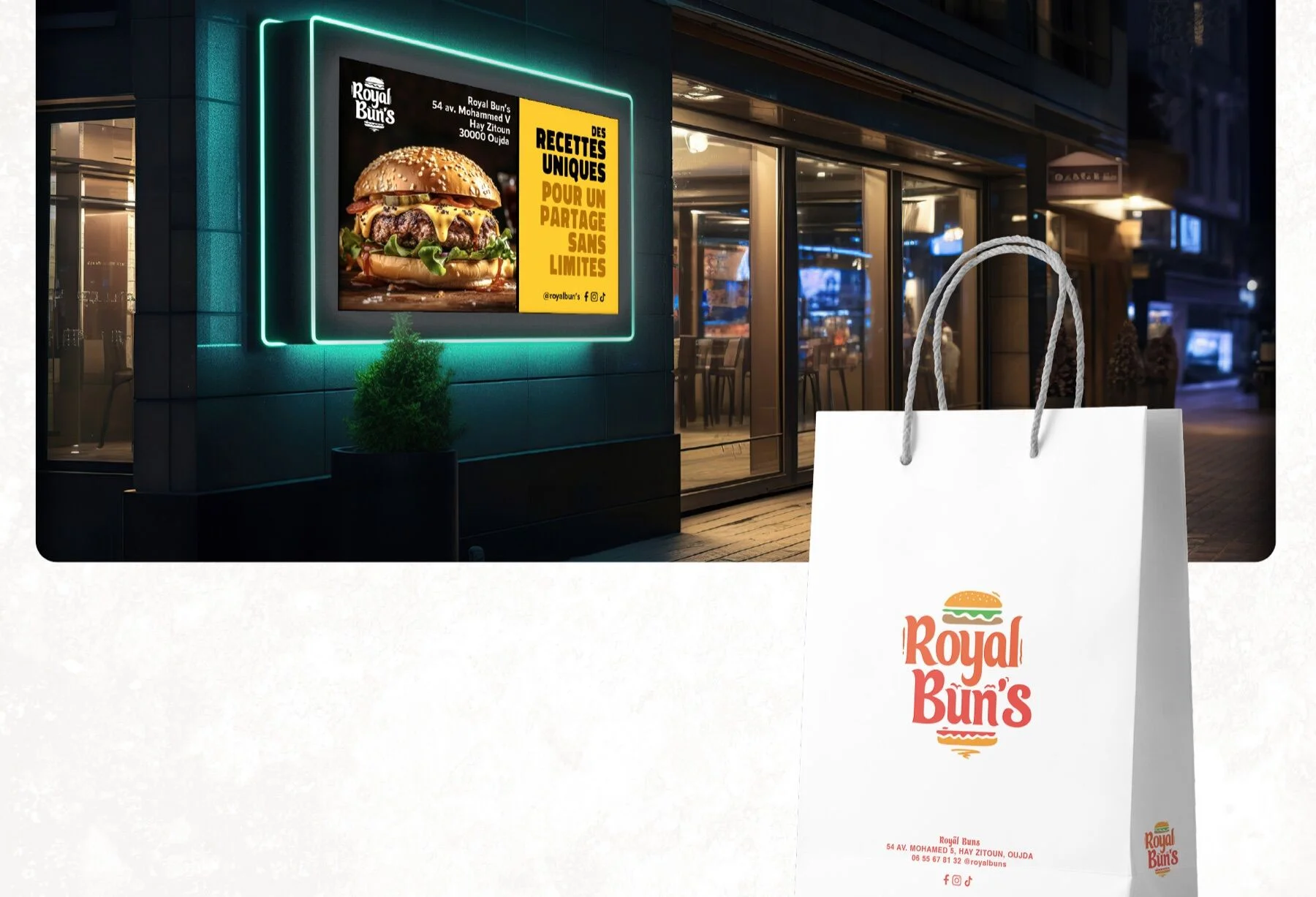
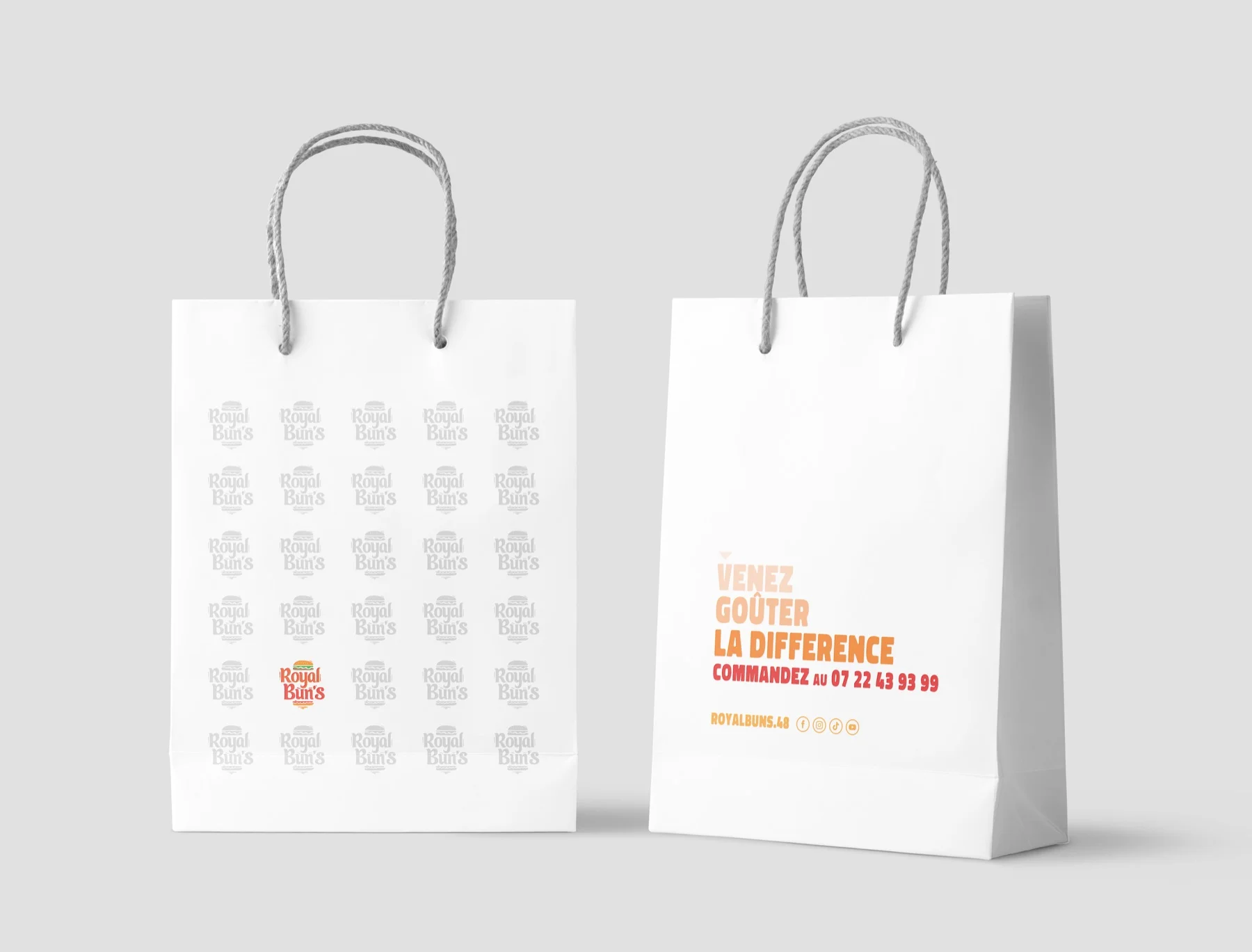
A warm, playful signature designed to work just as well as a round illuminated sign as it does small-scale on a sticker or a kraft bag.
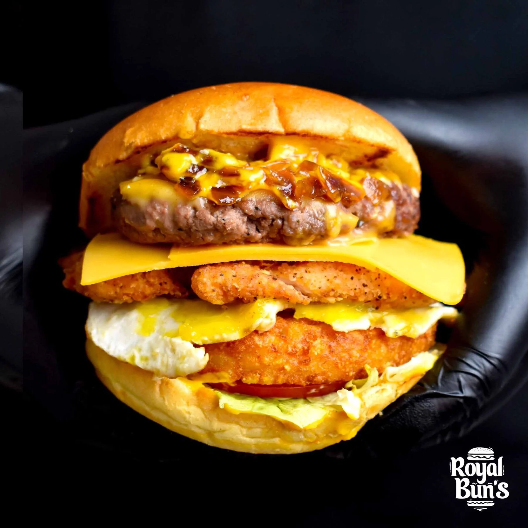
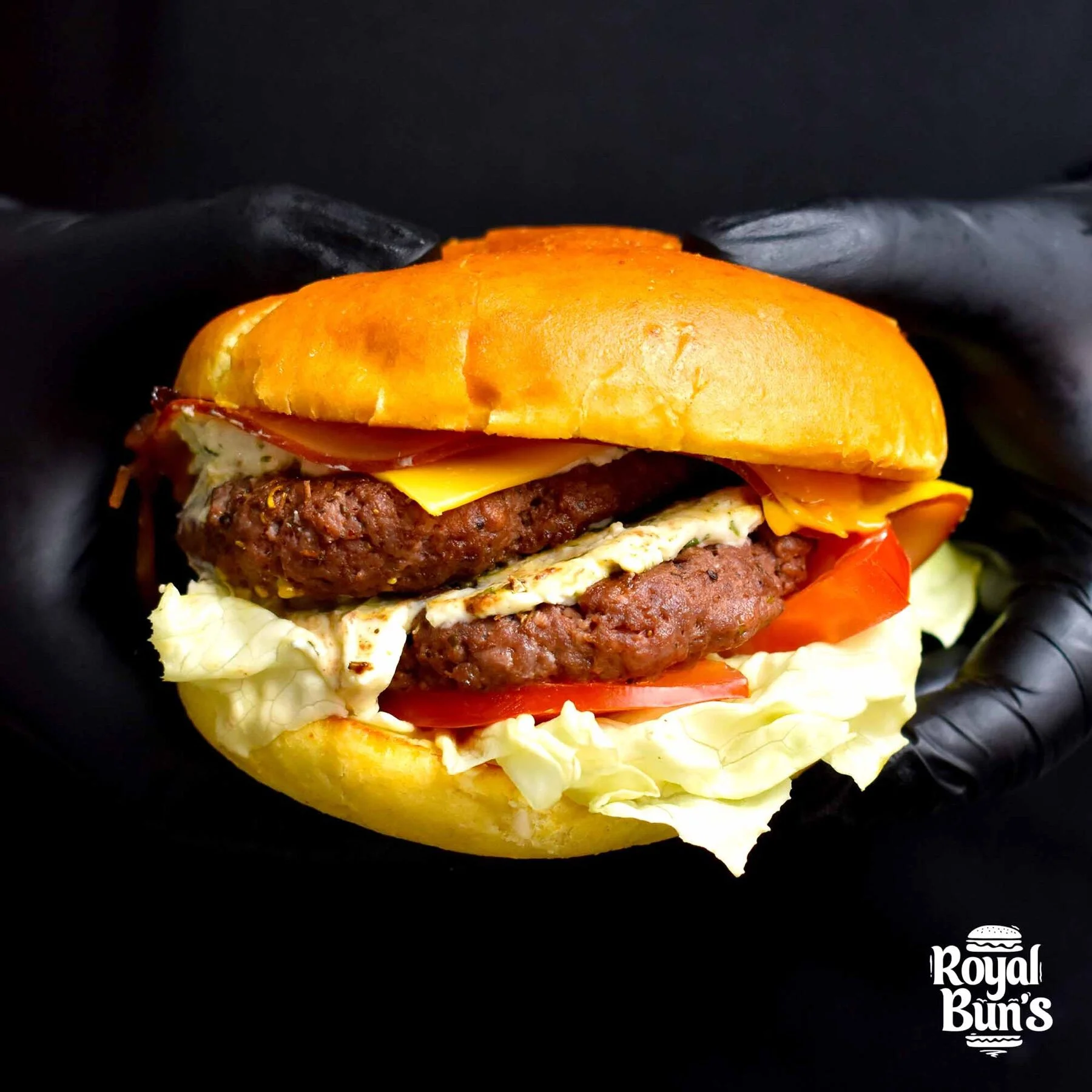
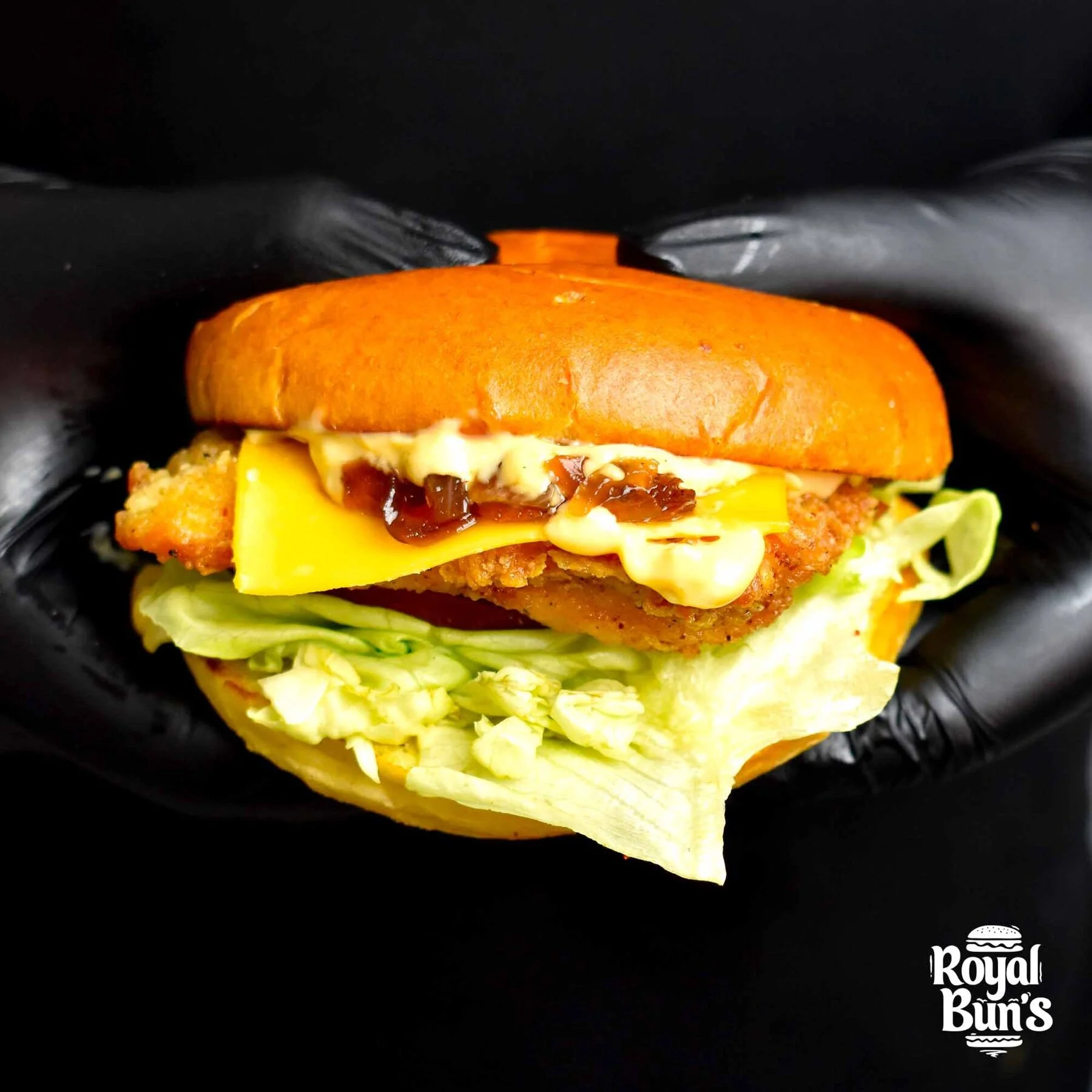
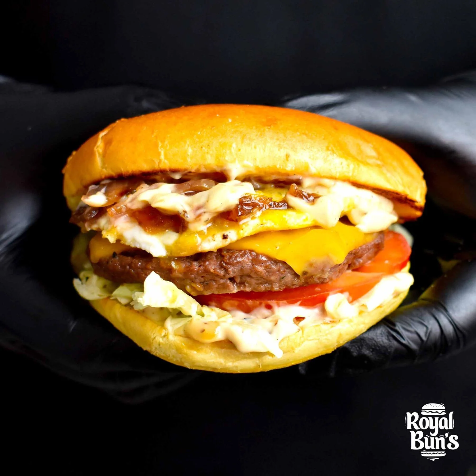
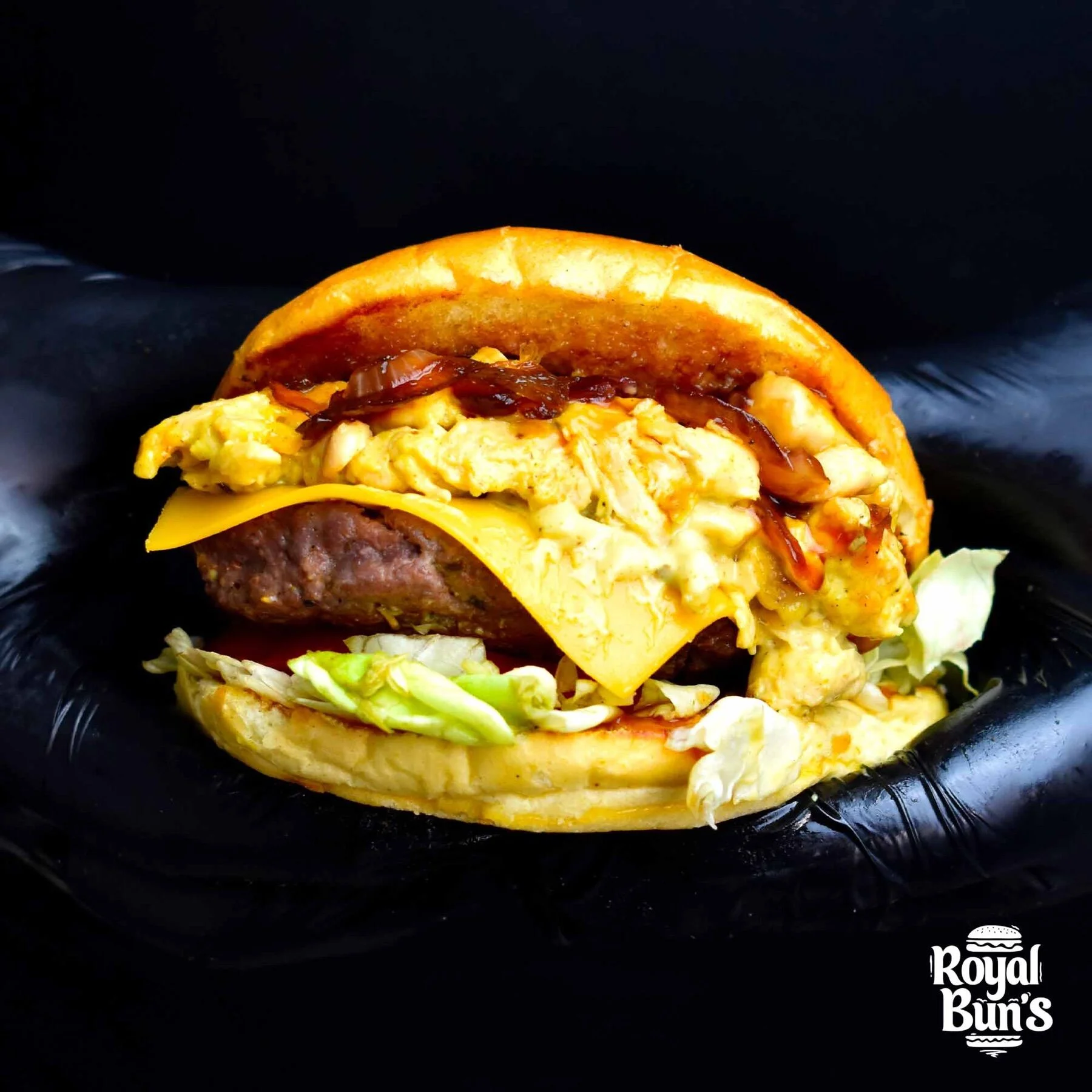
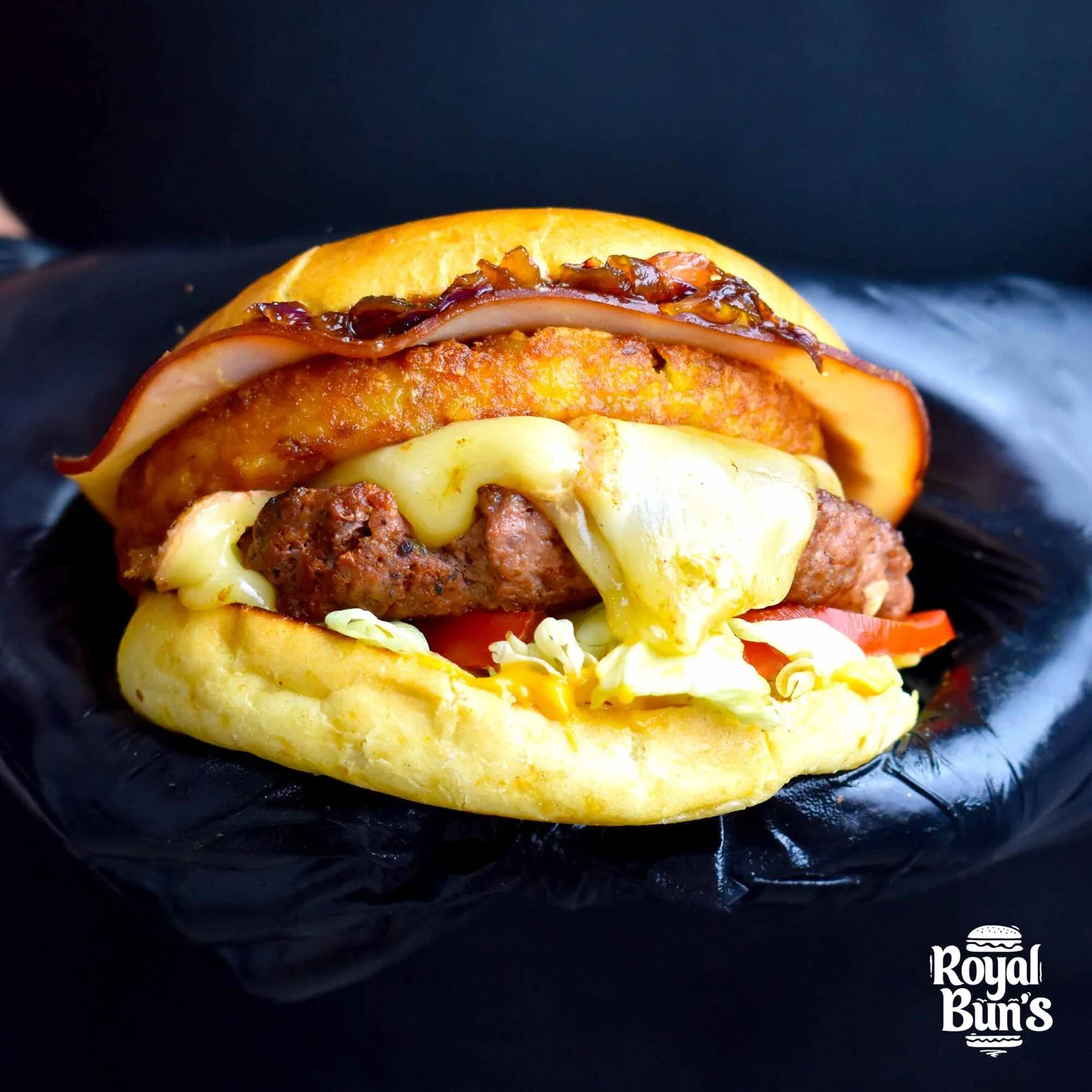
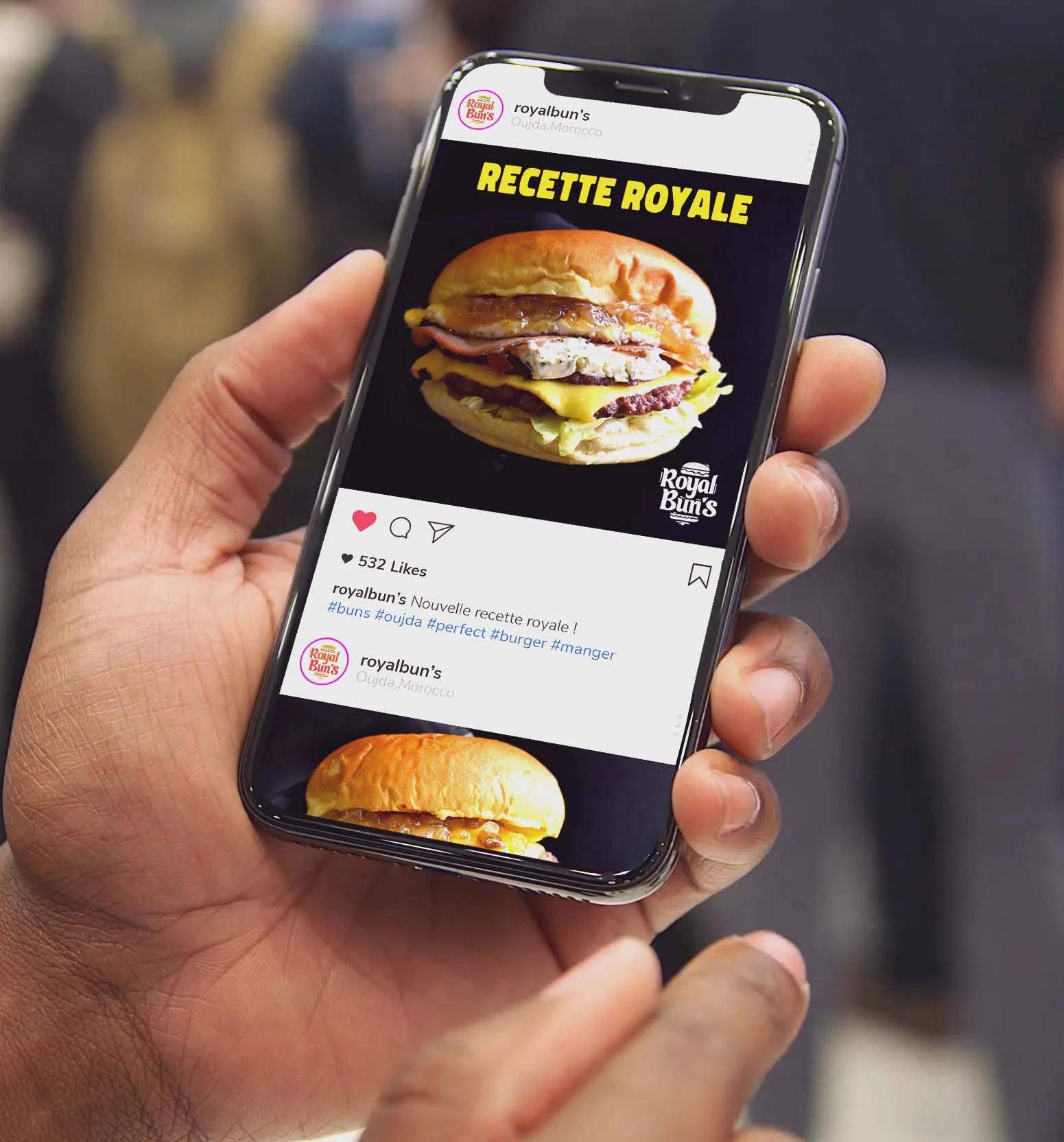
A polished photographic direction for every recipe: warm light, dark backdrops, mouth-watering close-ups. Plenty to feed the menu, the boards, social media and outdoor displays.
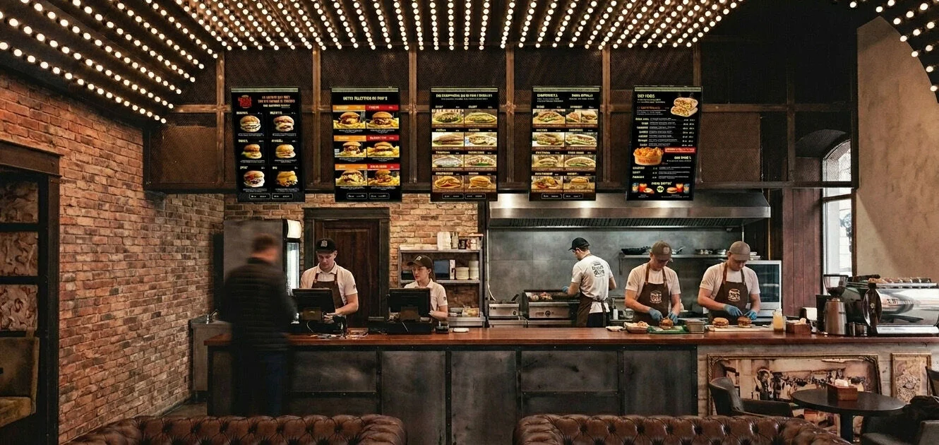
From the Instagram feed to the kraft bag, from the team's polo shirt to the neon sign — the world rolls out across every touchpoint, always indulgent, always consistent.
“ Burgers & Tacos, made from scratch. ”