Versterking.
Purity, in your life.
Purity, in your life.
Versterking is a French-Dutch pharmaceutical company developing natural cosmetics — essential oils, skincare, a shaving line. Sprawling product ranges, all to be structured under one brand.
The challenge: to create a brand identity that inspires the trust of the laboratory while keeping the warmth of the natural product — and that works just as well in French as in Dutch, across dozens of references.
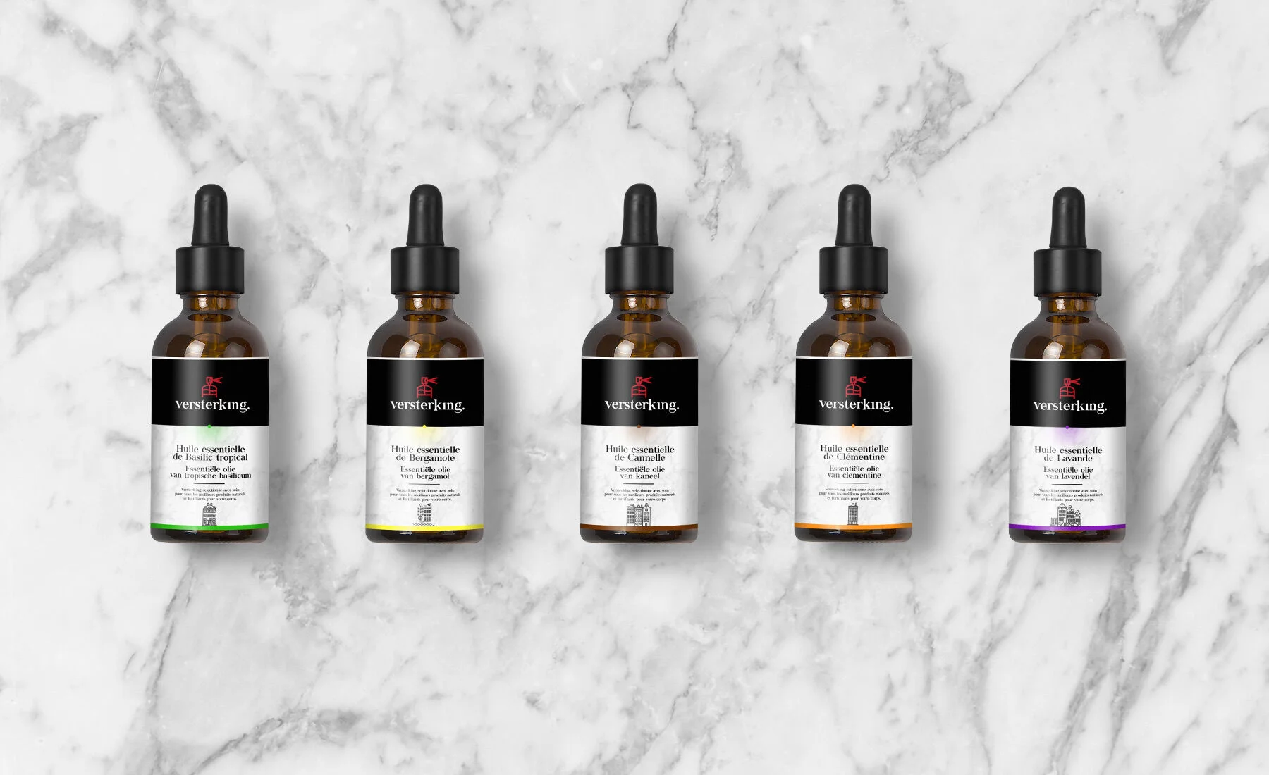
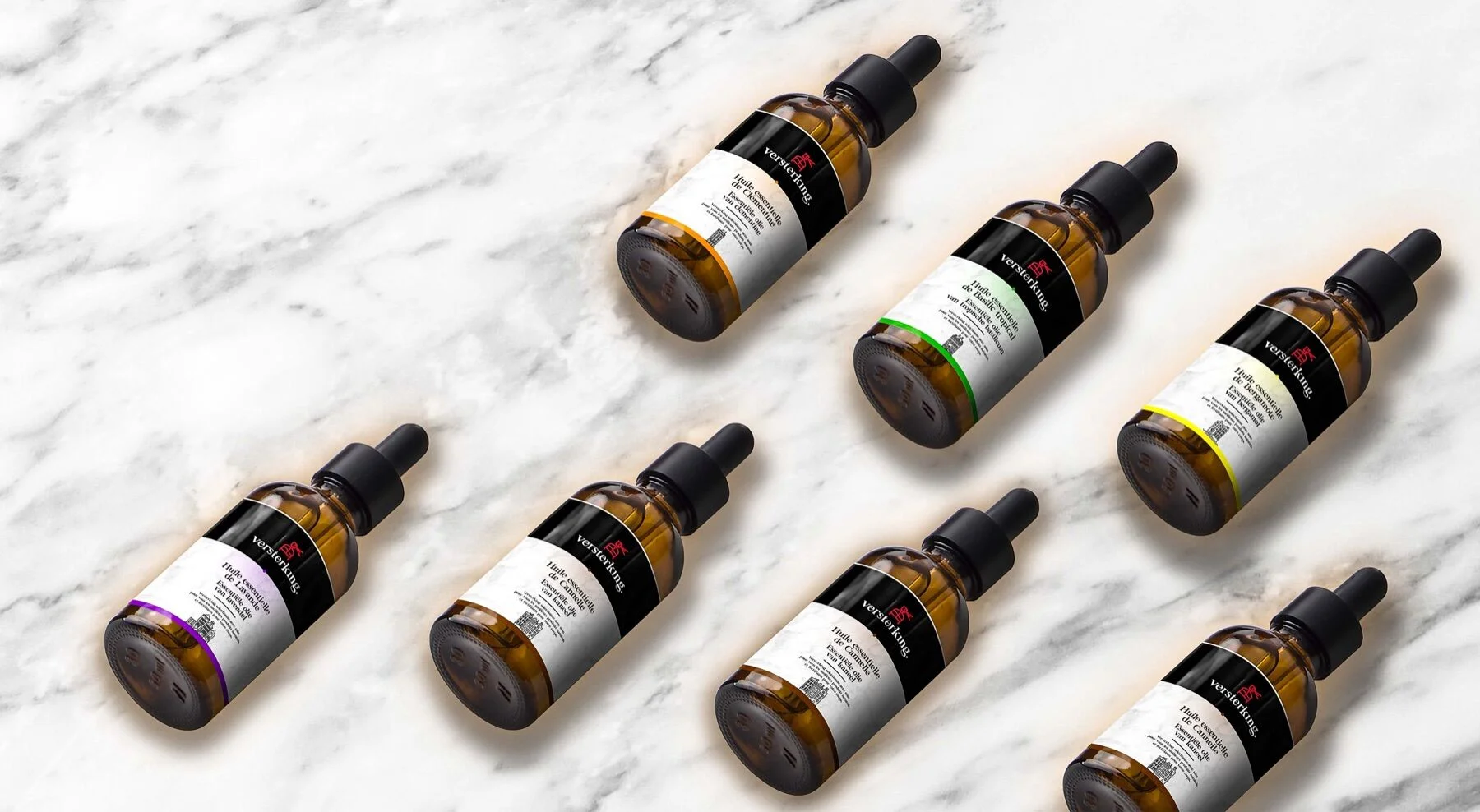
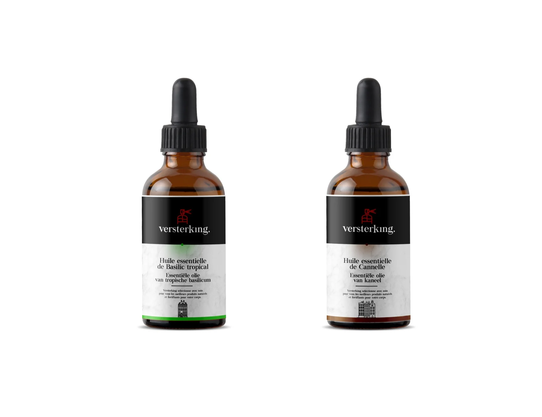
The heart of the identity: a wordmark set in a contemporary serif, clinically precise, marked by a red dot — the spark of life, the gesture that sets it apart. Above it, a red pictogram traces a stylised bottle, the brand's graphic signature.
From the symbol alone to the full lockup, the system stays legible at every scale — from the bottle label to storefront signage.
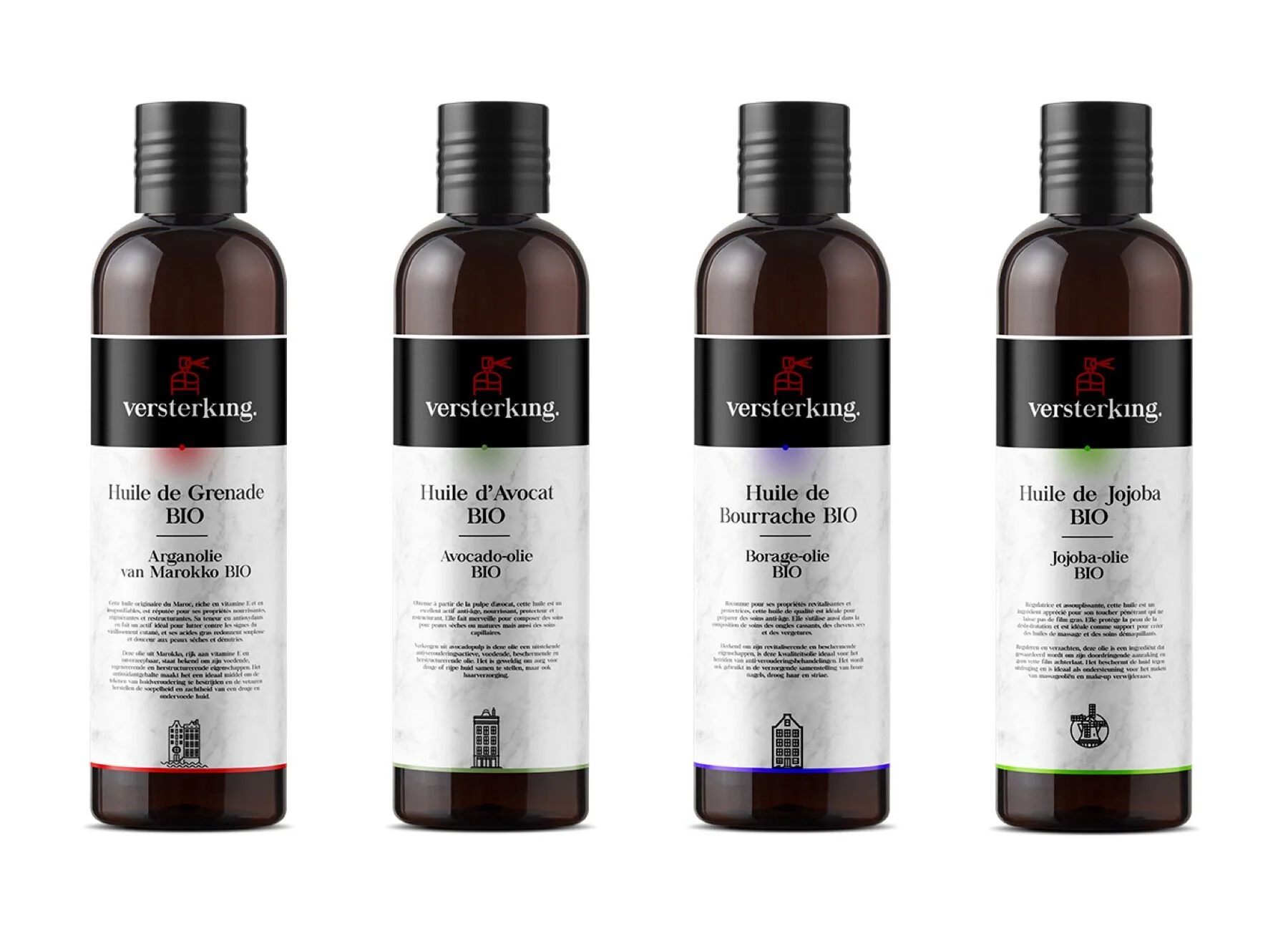
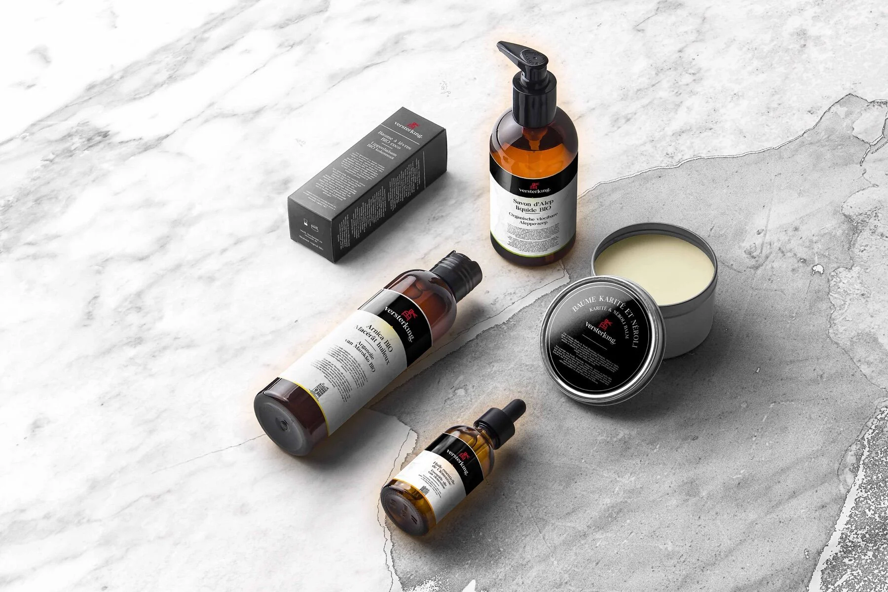
The core of the range: essential oils in amber dropper bottles. Each scent carries its own colour, each label its own name — in French and Dutch. A system that is clear, scalable, and resolutely premium.
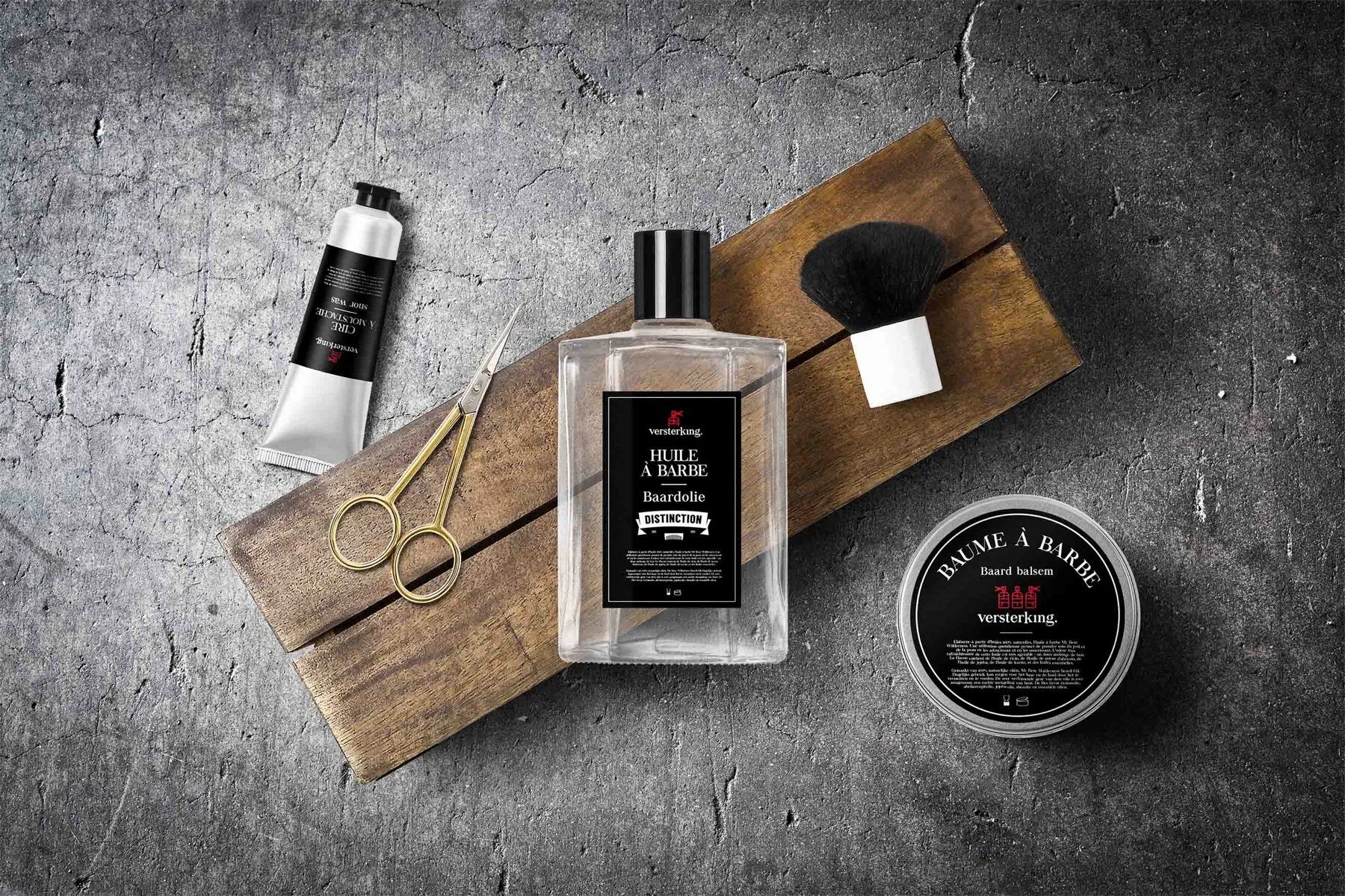
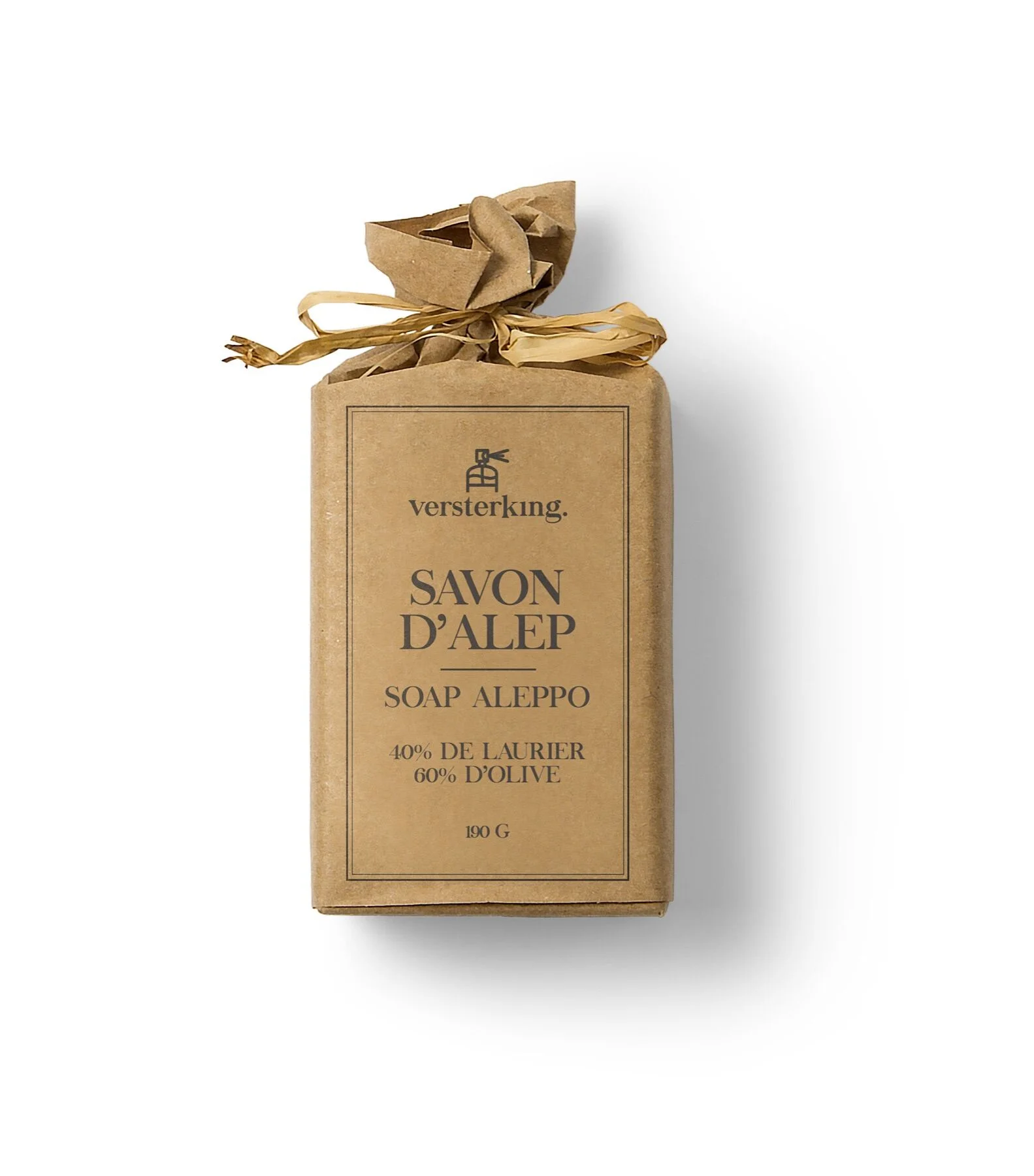
For the men's range, we flip the register: black labels, red accents, raw materials. Beard oil and balm, Aleppo soap, grooming care — a denser, more ritual world.
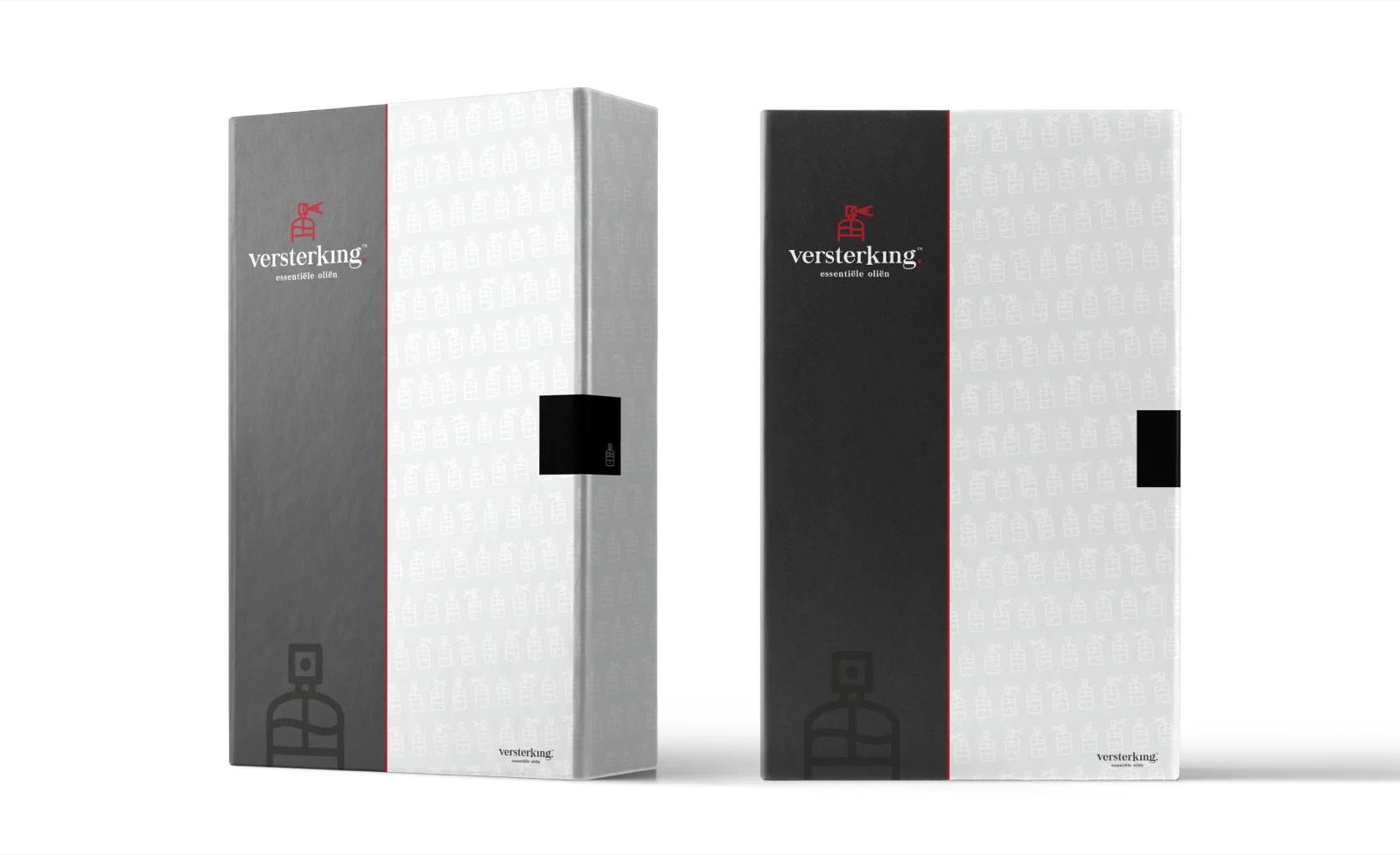
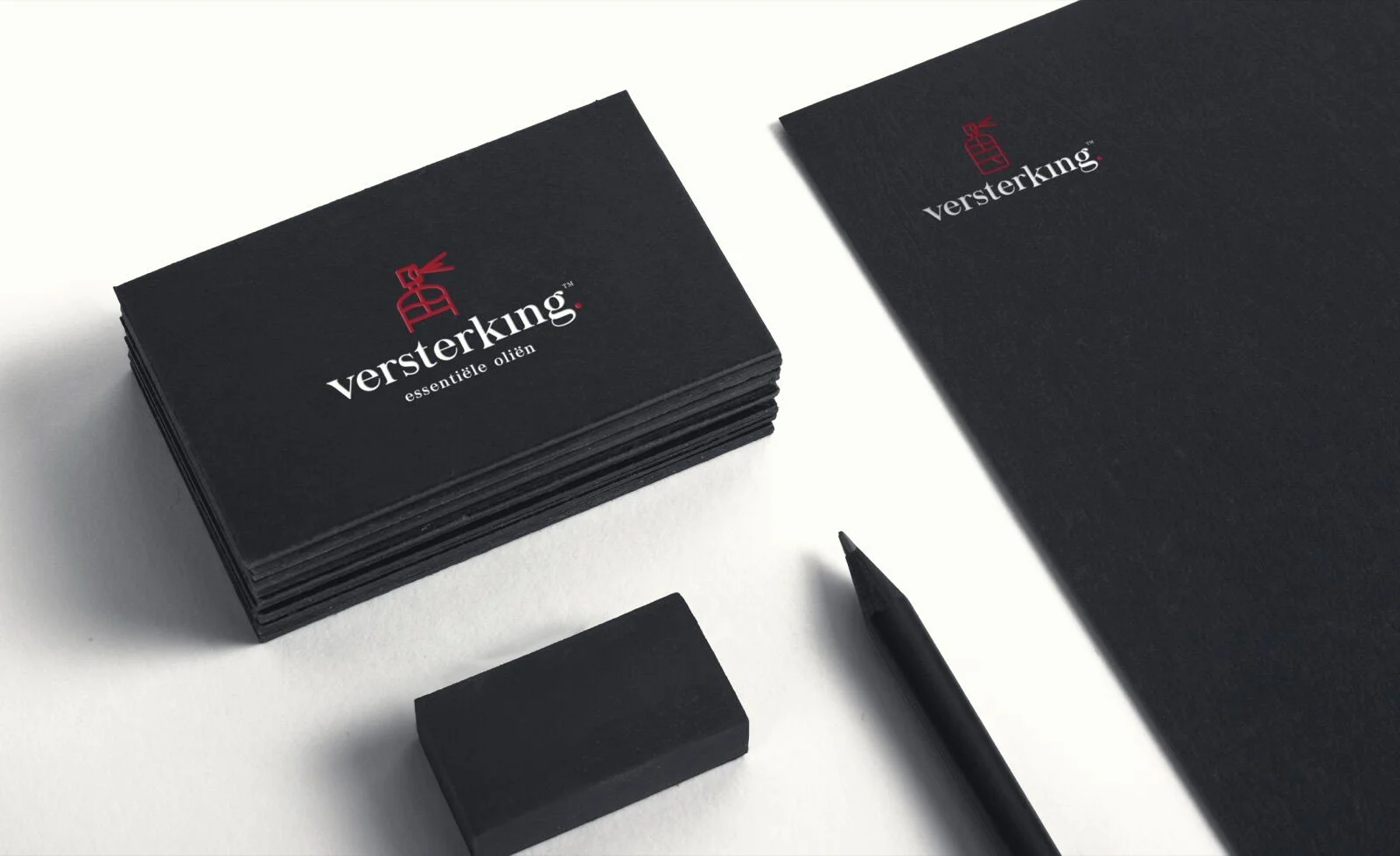
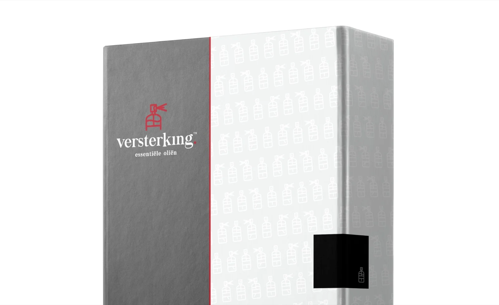
The identity extends across every touchpoint: patterned gift boxes, stationery, business cards, and an outdoor poster campaign — "Zuiverheid in je leven?"
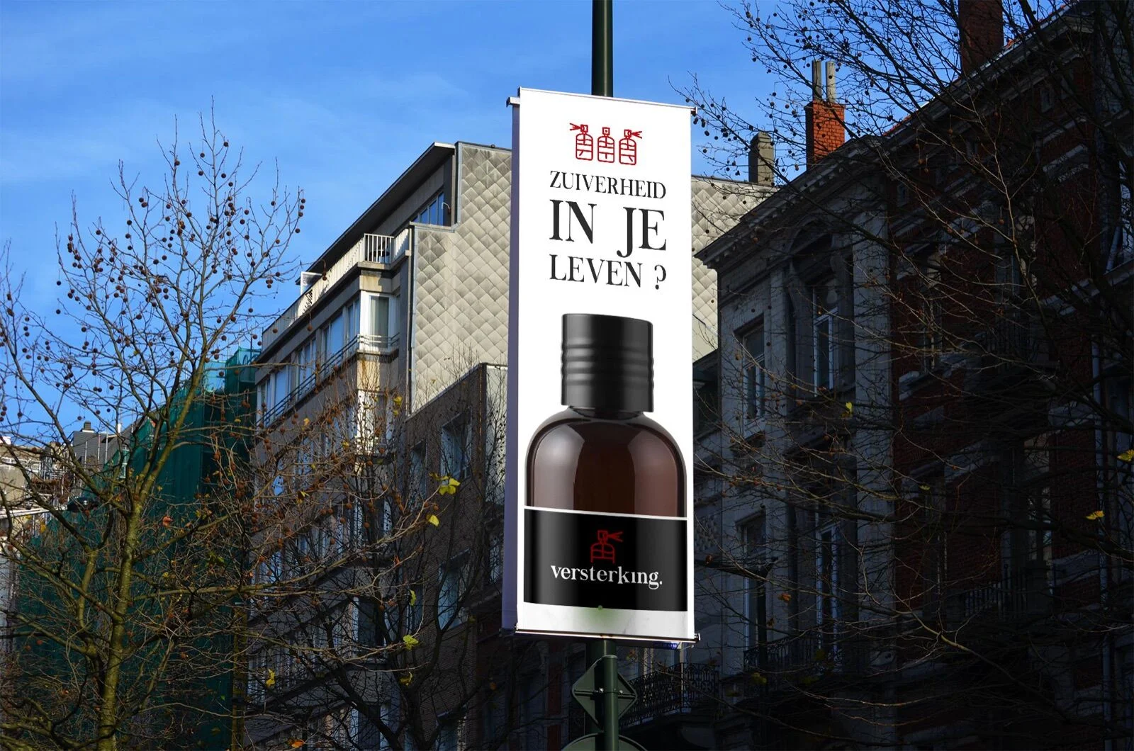
"Zuiverheid in je leven."
Purity, in your life.