How we build
an identity at Niyah.
A transparent look at our six-step method — from the first brief to the delivery of the brand book — for creating a brand identity that lasts.
A brand identity is not a logo. Nor is it a set of brand guidelines. It's a system — a visual, verbal and emotional grammar — that allows a company to be recognised, understood and desired. Building it takes time. Far more than most clients imagine at the briefing stage.
At Niyah Design, an independent communication agency, we eventually formalised a six-step method. Not a rigid process applied mechanically to every project, but a backbone that structures the work and reassures the client. Here, transparently, is how we work — from the initial listening session to the delivery of the brand book.
“An identity is not what a brand shows. It's what it leaves with those who cross its path.”
Step 01Listening — asking the right questions before drawing
It all starts with a conversation. Not a fifteen-page PDF brief, not an online questionnaire: a real discussion, over video call or a coffee, lasting between one and two hours. We talk far more about the founder, their story, their doubts and their obsessions than about the colours they like. Because colour will come later — posture is there from the very start.
At this stage, we're trying to understand three things: why this brand exists (its real reason for being, not the one from the pitch deck), who it truly speaks to (going beyond marketing personas), and what it wants to shift in its market. Creating a brand identity without these answers is like drawing a façade without knowing the building behind it.
Step 02Research — getting out of the studio
Good art direction isn't born in front of a Pinterest screen. It's born by going out and looking. We visit the client's spaces whenever possible (shop, restaurant, workshop), we study their competitors — not to copy them, but to identify what nobody is doing in the sector. We also draw on distant references: if it's a food project, we look towards cosmetics; if it's beauty, we look towards publishing.
This stage produces a territory document — around twenty pages that map the market, identify two or three blind spots to exploit, and set out a brand promise that becomes our compass. It's also the moment when we sometimes come back to the client with uncomfortable questions. That's normal. Better to be uncomfortable now than at delivery.
Strategy — to choose is to let go
A strong identity is built as much by what it excludes as by what it includes. At this stage, we set the positioning in a single sentence, define the brand personality (five adjectives at most, not an endless list), and write the key messages that will feed the entire visual system to come.
We present this strategic platform to the client in a half-day workshop. This is where the real decisions are made: should we speak to young parents or to grandparents? Should we embrace luxury or cultivate accessibility? Should we sound local or international? Every choice closes some doors but opens others, clearer ones. To go further, we recently wrote an article on the difference between branding and the logo — this is exactly the moment in the project when that distinction becomes concrete.
Step 04Visual exploration — three directions, not thirty
Only now do we pick up the pencil. Starting from the approved strategy, we develop three distinct art directions, each with its own moodboard, typographic options, colour palette and a first logo treatment. Not thirty options — three. Giving the client too many choices means asking them to make the call in our place. Our job is to pre-select.
Each direction is defensible, but each makes a different bet. It's during the presentation that we make our case, listen to the instinctive reactions, and begin to sense where the client's energy settles. Sometimes the choice is made in five minutes. Sometimes we leave with a fourth, hybrid direction. Both are valid.
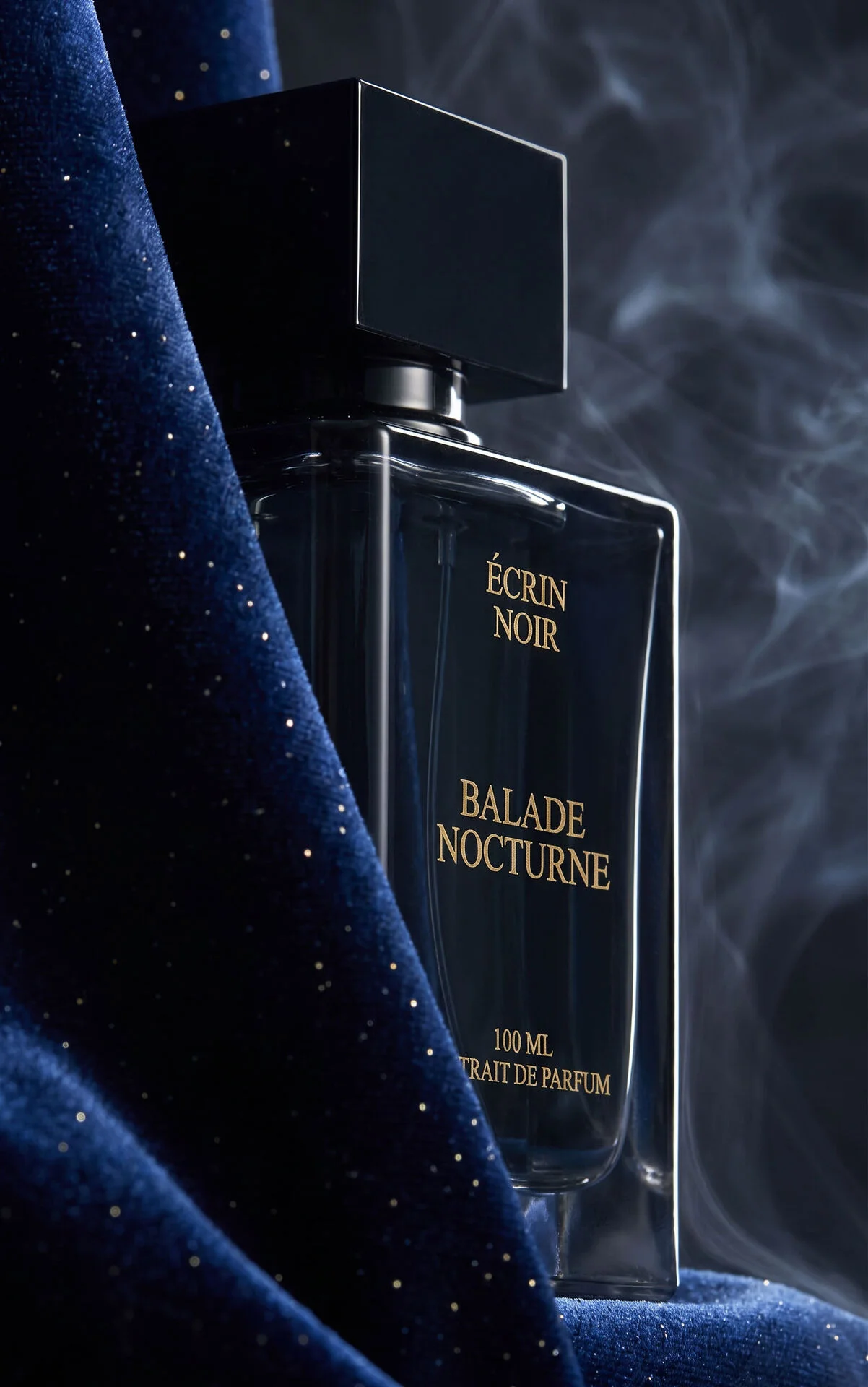
You can see this stage at work on the Baïlonn project, where the move from the initial moodboard to the final drawings shaped everything that followed, or on Goodfly, whose wordmark + plane pictogram signature was born from an exploration across three radically different routes.
Step 05The system — building the blocks
The logo is approved? Great. The real work begins now. A logo alone doesn't make a brand. What makes a brand is the consistency of all the building blocks around it. At this stage, we design:
- The typographic system: headings, subheadings, body text, signage — with its usage rules
- The complete colour palette: primaries, secondaries, neutrals, and their print/web/RGB equivalents
- The photographic treatment: style, framing, retouching, or a bespoke shoot when the budget allows
- The iconographic language and the associated graphic patterns
- The tone of voice: how do we write? Formal or familiar? Serious or playful?
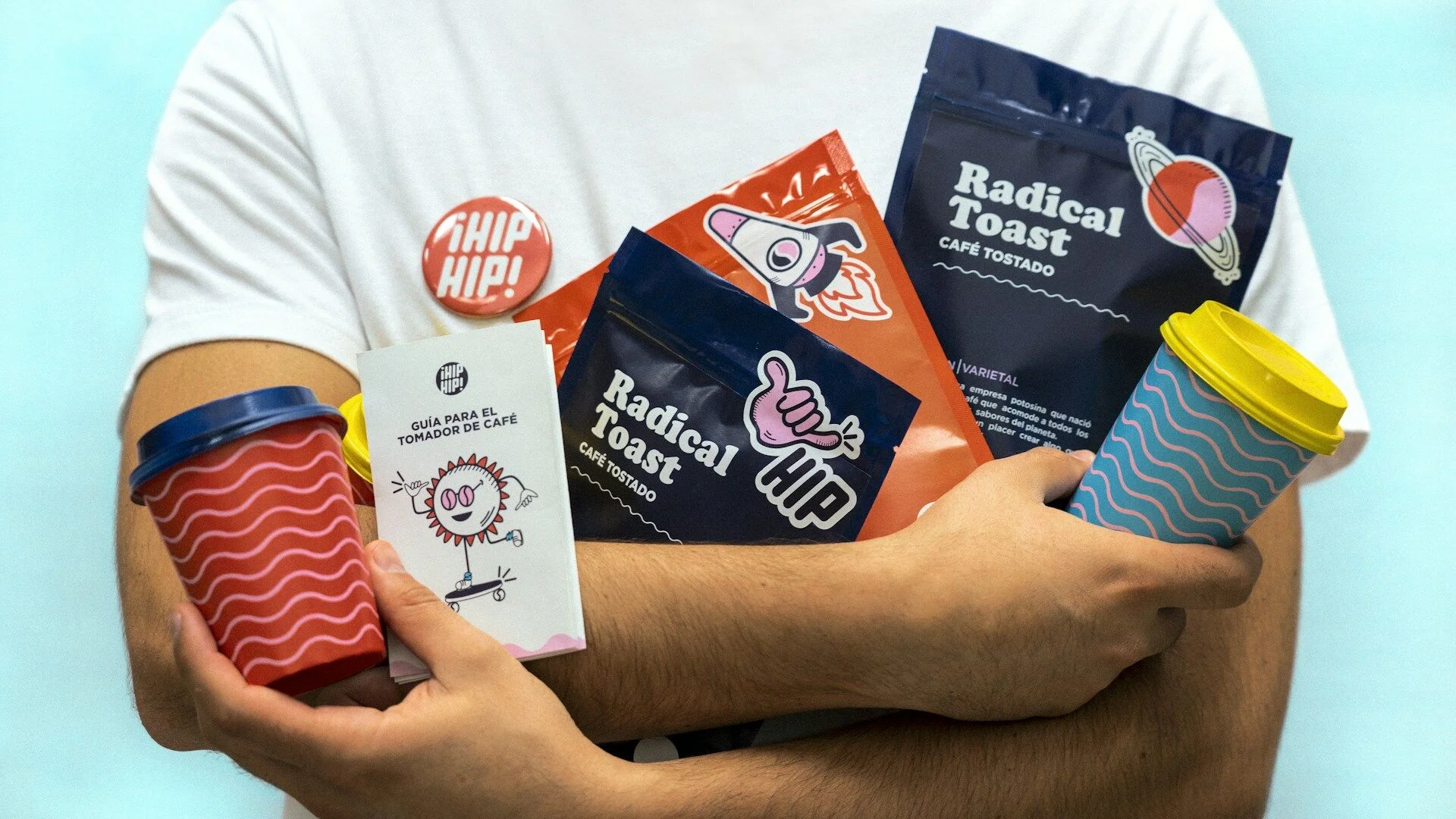
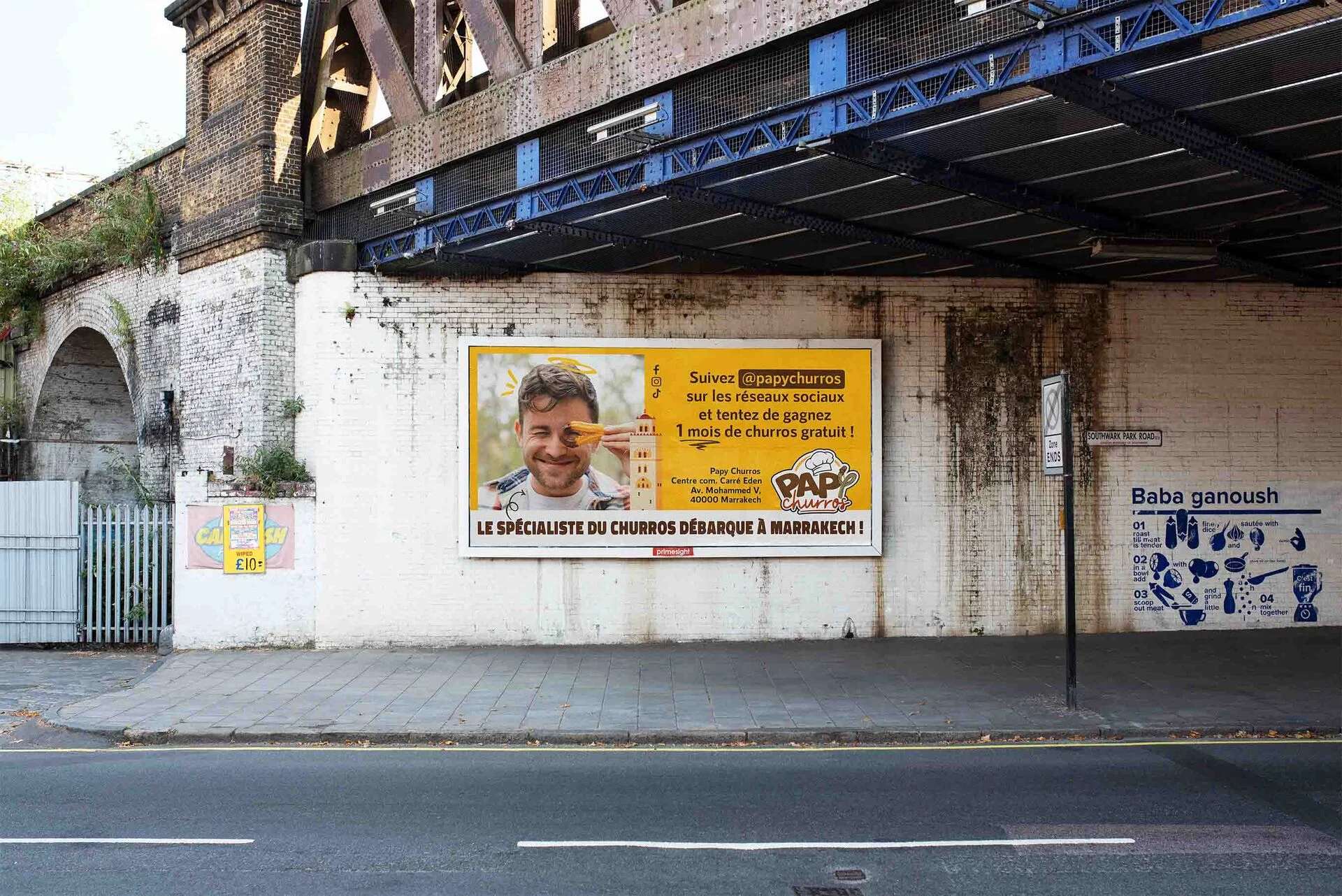
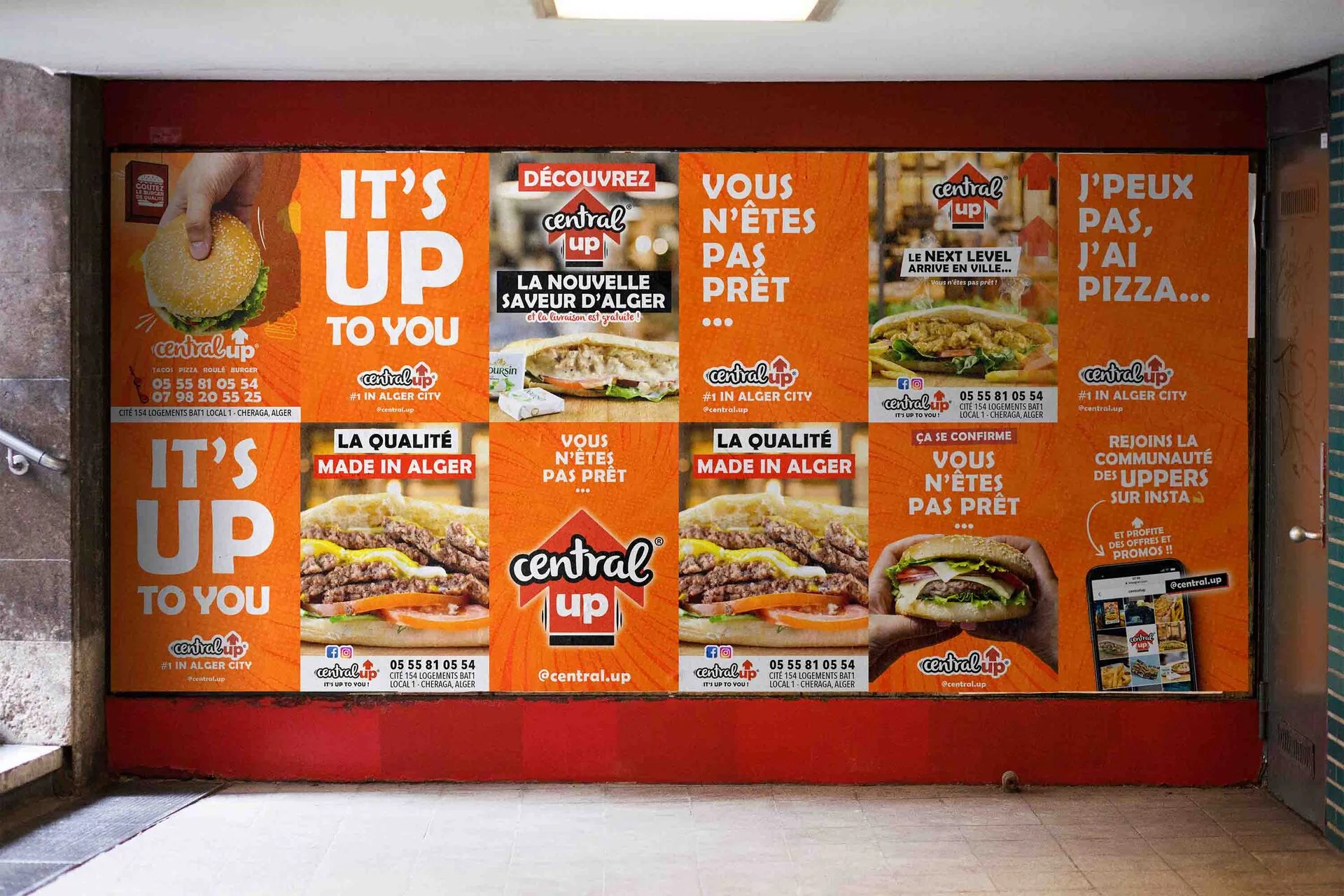
- The applications: business card, email signature, storefront, packaging, signage, social media
This is the longest stage of the project — often four to six weeks. It's also the one that makes the difference between a pretty identity and one that holds up when you ask it to scale. A brand isn't a visual: it's a behaviour repeated a thousand times across a thousand touchpoints.
Delivery — the brand book, and beyond
The identity is finished, but the project doesn't end with sending the files. We deliver a complete brand book — 20 to 30 pages depending on the project — that documents all the rules, provides the resources (vector logos, fonts, templates) and explains why each decision was made. This last point is crucial: a brand book that only says “here are the colours” is useless. A good brand book explains the reasoning, so the client's internal teams can make consistent decisions once we're no longer around.
We also plan a handover moment: a two-hour session with the client's teams to bring the identity to life for them, answer questions, and anticipate edge cases. Because a well-made identity isn't simply delivered: it's passed on.
“An identity is delivered. And then it is lived.”
What we take away from this process
Six steps, between twelve and sixteen weeks on average. It's not the fastest method on the market — we know agencies that deliver an identity in four weeks. But we've never seen an identity built in a rush last five years. Speed has a price, and that price is usually paid by the client two years later, when everything has to be redone.
At Niyah, we work with few clients at a time, precisely so we can give them that time. If you have a brand identity creation project that deserves more than a logo and a five-page PDF, we'd be delighted to talk about it. Get in touch — the first conversation is always free.