What zellige taught me about composition.
Cultural inspiration and contemporary design: how seven centuries of Moroccan geometric mosaic still shape the way we compose a page.
The first time I truly looked at a zellige panel — not just to see it, but to understand it — was in a riad in Fez. I had already been a graphic designer for a few years. And I realised that what I had spent months learning from graphic composition textbooks, a Moroccan craftsman had solved centuries earlier, by hand, tile after tile.
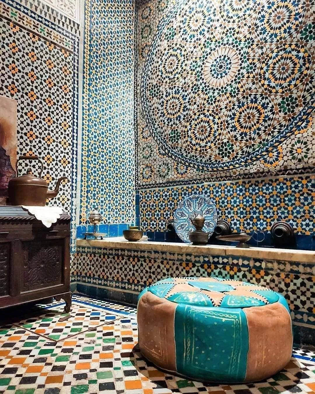
Zellige is an art of geometric mosaic born in Morocco, made of glazed earthenware tesserae cut and assembled into patterns. But to reduce it to mere decoration is to miss the point entirely: above all, it is a system of composition, governed by rules that every designer would do well to know.
“The freedom of a pattern only reads against the backdrop of a flawless grid.”
Principle 01The grid is not a constraint, it is a liberation
Zellige rests on an invisible modular grid. Every piece, however small, fits into a precise mathematical network. No chance, no approximation. In graphic design, the grid is nevertheless often experienced as a prison: we want to “break the rules,” to step outside the frame.
But look at the most intricate panels of the Hassan II Mosque in Casablanca: the visual explosion you feel exists only because the underlying structure is faultless. Freedom is born of rigour. It is a principle we apply systematically at Niyah Design: before chasing originality, we establish structure. Surprise only reads against a backdrop of coherence.
Principle 02Repetition creates rhythm, rhythm creates identity
A zellige pattern is not a single image: it is a unit that repeats. That repetition generates a hypnotic visual rhythm, a signature recognisable even from a distance. In visual identity, this is exactly what we call a brand pattern.
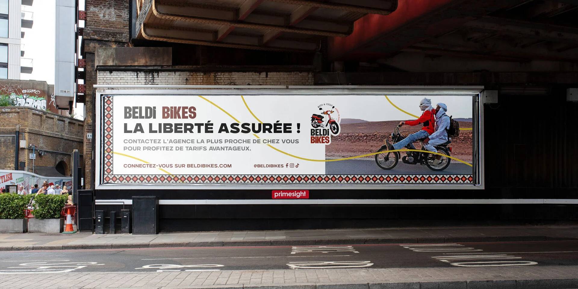
Great identities never come down to a logo: they have a visual cadence that runs across every medium. We drew clearly on zellige for Saïmetti — a pattern that builds the product packaging, born of what we observed across the various Moroccan cities we travelled through: Fez, Marrakech, Agadir… Identity is not read in any single element, but in the repetition of a system.
The harmony of opposites
What fascinates me about zellige is its ability to make radically different shapes coexist — stars, polygons, broken lines — in perfect unity. No shape dominates. They all serve one another.
In typography and layout, the logic is the same. Pairing a massive display typeface with a fine text face, a dark background with an acid colour, a raw photograph with a vast expanse of white space: it is creating tension in order to resolve it all the better. This is what we call visual hierarchy, and zellige is a silent master class in it.
Principle 04Cultural constraint as a creative engine
There is an ongoing debate around universal design — the idea that good design would speak to everyone, everywhere, in the same way. I don't really believe in it. The most striking work I have seen is deeply rooted somewhere: it carries a memory, a geography, a way of seeing the world.
Zellige is Moroccan. The Swiss typography of the Basel school is resolutely European. Otl Aicher's pictograms for Munich 72 carry a German restraint. Starting from zellige, from arabesques or from Arabic calligraphy is not folklore — it is building a visual vocabulary that has something to say, in a world saturated with generic imagery. This is the ground that Studio BDouin works so brilliantly in publishing: worlds rooted in contemporary Muslim culture, without ever lapsing into caricature.
What this changes in our work
When we build an identity at Niyah Design, we often start with a question that is not “what style?” but “what culture?”. What is this brand's story? Which community does it speak to? Which visual codes truly belong to it?
- A halal restaurant in Lille does not share the codes of a Parisian brasserie
- A moped rental company in Marrakech does not have the identity of a bike rental in Amsterdam
- A Muslim children's publishing house does not speak the same visual language as a mainstream publisher
This is not a value judgement — it is a cultural reality. To deny it is to produce generic design. To work with it is to create something that resonates.
“A design that knows where it comes from always has more to say.”
In conclusion
Zellige taught me that the most sophisticated systems are often the oldest. That rigour is not the enemy of beauty, but its condition. And that an owned cultural inspiration is worth a thousand borrowed trends. If you'd like to see how we translate these principles into our projects, the door is open — the first conversation is always free.